The Master Guide to Affordable Luxury Interior Design Rules: 5 Secrets to a High-End Home
Disclosure: This post contains affiliate links. I may earn a small commission at no extra cost to you.
Note: Some images in this post are AI-generated for visual inspiration. For exact specifications and reviews, please refer to the product listings linked throughout this guide.
In This Guide:
The 60-30-10 Color Rule: Mastering the Palette of Luxury
How to Apply the 60-30-10 Ratio
- 60% (The Anchor): This is the foundation of your affordable luxury aesthetic. It should be a warm, muted neutral like “greige,” sand, or a creamy off-white applied to the walls and largest rugs.
- 30% (The Secondary): This provides the architectural depth needed for a high-end look. I recommend using this for upholstery, curtains, and accent furniture to create a layered, “collected” feel.
- 10% (The Accent): This is your “jewelry” where you introduce metallic finishes, bold textures, or darker contrasts.
Comparison: Basic DIY vs. Affordable Luxury
| Design Element | Basic DIY Approach | Affordable Luxury Interior Design Rules |
|---|---|---|
| Color Split | Random or 50/50 | Strict 60-30-10 Ratio |
| Neutral Base | Cold Stark White | Warm, Layered Neutrals |
| Accent Choice | Plastic/Cheap Metal | Solid Brass or Honed Stone |
| Texture | One-Dimensional | Multi-Layered Tactile Fabrics (Tip: See how to layer organic textures in our French Linen Home Design Guide) |
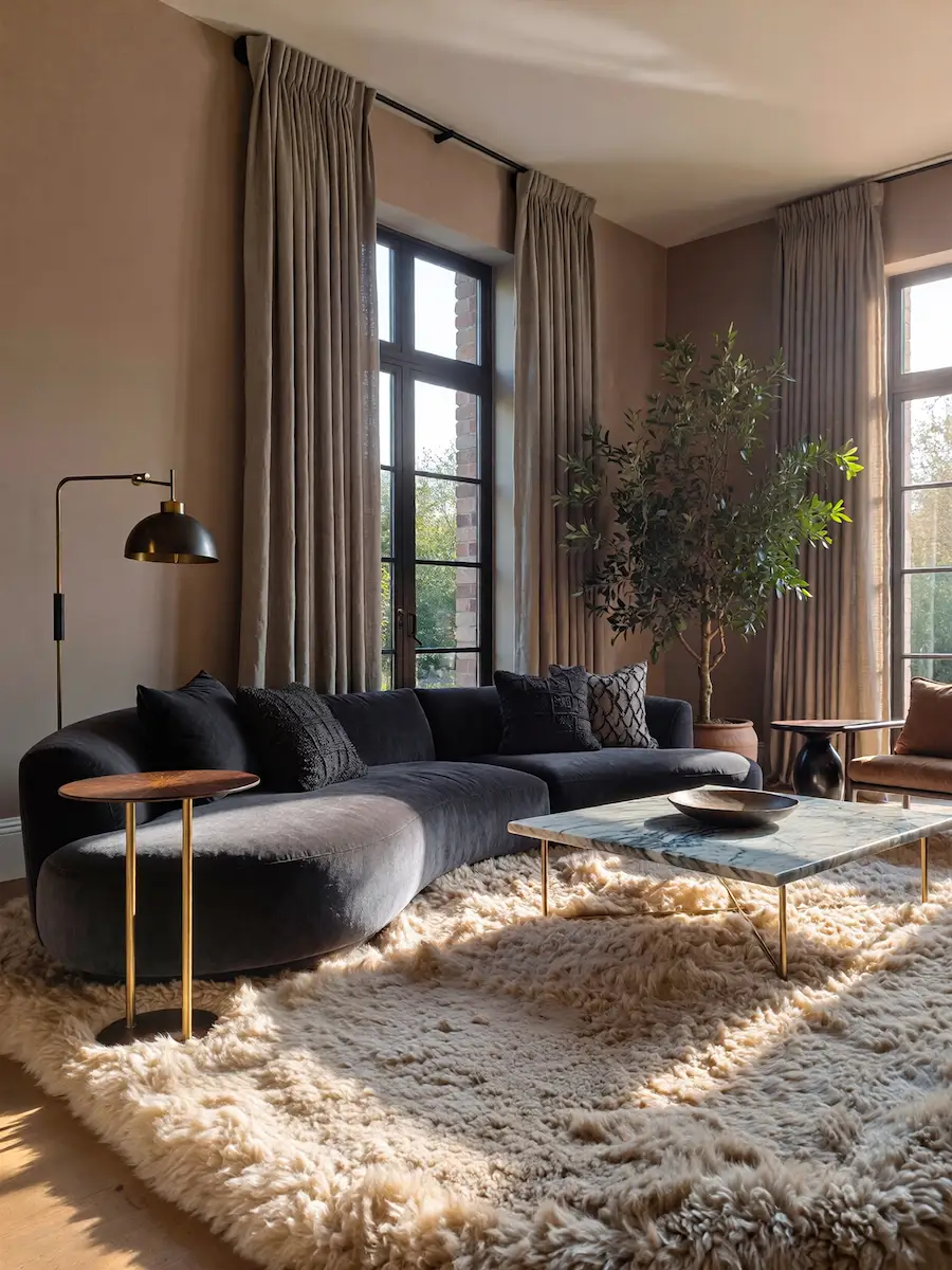
The Power of Symmetry and the Focal Point
Shop the Look: The Foundation Edit
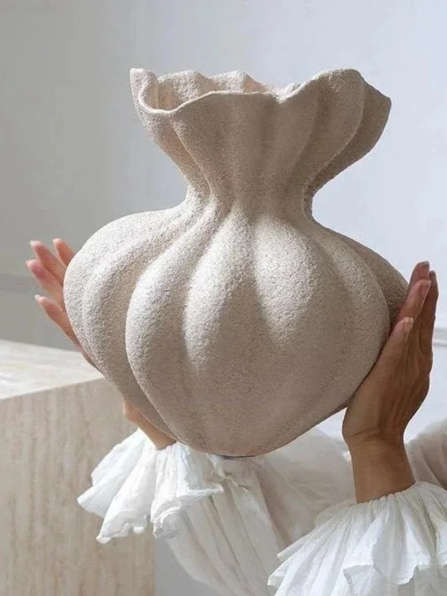
The 10% Accent: Sculptural Matte Ceramic Vases — Search: “French Minimalist Ceramic Vase Floral Vessel Table Centerpiece“
Why I chose this: These add the architectural 10% accent needed for the 60-30-10 color rule without overwhelming the space.
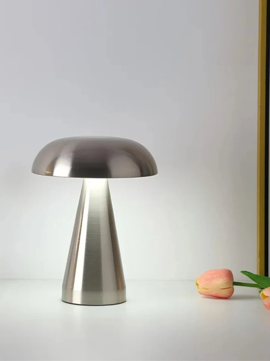
The Symmetrical Pair: Modern Linen Bedside Lamps — Search: “Linen Shade Table Lamp Modern Mushroom“
Why I chose this: Buy two of these to create perfect symmetry on a console table or nightstands for an instant high-end look.
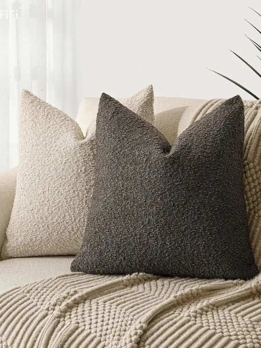
The Designer Texture: Heavyweight Bouclé Cushion Covers — Search: “Thick Boucle Pillow Cover Luxury Texture“
Why I chose this: Texture is the “secret language” of affordable luxury; these add the 30% depth to any sofa.
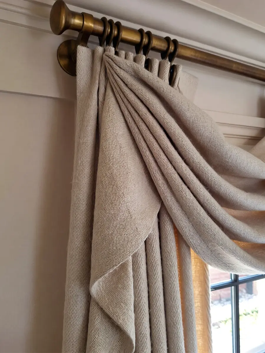
The "High and Wide" Rule: Luxury Window Treatments
In my early days of decorating, I made the mistake of hanging my curtain rods right at the window frame.
It made my ceilings feel low and the room feel “boxed in.”
If you want your ceilings to look ten feet tall and maximize spatial harmony, you must follow the “High and Wide” hanging rule.
This is one of the most critical Affordable Luxury Interior Design Rules because it changes the very architecture of your room without a renovation.
I always recommend hanging your curtain rod as close to the ceiling as possible—usually 4 to 6 inches below the crown molding.
By doing this, you draw the eye upward, creating the grandeur and height found in five-star luxury suites.
Extending the Visual Width
Additionally, your rod should extend 8 to 12 inches beyond the window frame on each side.
When your curtains are open, they should only cover the window frame, not the glass itself.
This designer home styling hack makes your windows appear massive and allows maximum natural light to flood the room.
By following this rule, you significantly increase the perceived value of the space.
For the fabric, I always opt for Heavyweight Linen for a breathable, organic “Quiet Luxury” look.
Alternatively, choose Blackout Velvet for a dramatic, rich Affordable Luxury feel.
The Golden Ratio for Rug Scale and Placement
If I could change one thing in every home, it would be the size of the area rug. A rug that is too small acts like a “postage stamp,” making your high-end furniture look cramped.
According to Affordable Luxury Interior Design Rules, your rug should be the “anchor” that holds the entire seating arrangement together.
As noted by the National Wood Flooring Association, rugs aren’t just for comfort; they are essential for defining “zones” within a professional floor plan.
The "Legs On" Rule for Living Rooms
- Minimum Requirement: The front legs of all major furniture (sofas and accent chairs) must sit on the rug.
- The Luxury Standard: A rug large enough for all four legs of the furniture to sit comfortably on the surface.
- The Result: This creates a “floating island” of luxury that defines the space and adds immediate visual weight.
Choosing Materials for Curated Aesthetics
| Room Type | Minimum Rug Size | Affordable Luxury Goal |
|---|---|---|
| Living Room | 8′ x 10′ | 9′ x 12′ (All legs on) |
| Dining Room | 6′ x 9′ | 8′ x 10′ (Chairs stay on when pulled out) |
| Bedroom | 5′ x 8′ | 8′ x 10′ (Under the bottom 2/3 of the bed) |
Art Placement: The 57-Inch Center Rule
Shop the Look: The Architectural Edit
To follow these Affordable Luxury Interior Design Rules, you need tools and textiles that respect scale.
I have curated these specific items from AliExpress that mirror high-end showroom quality:
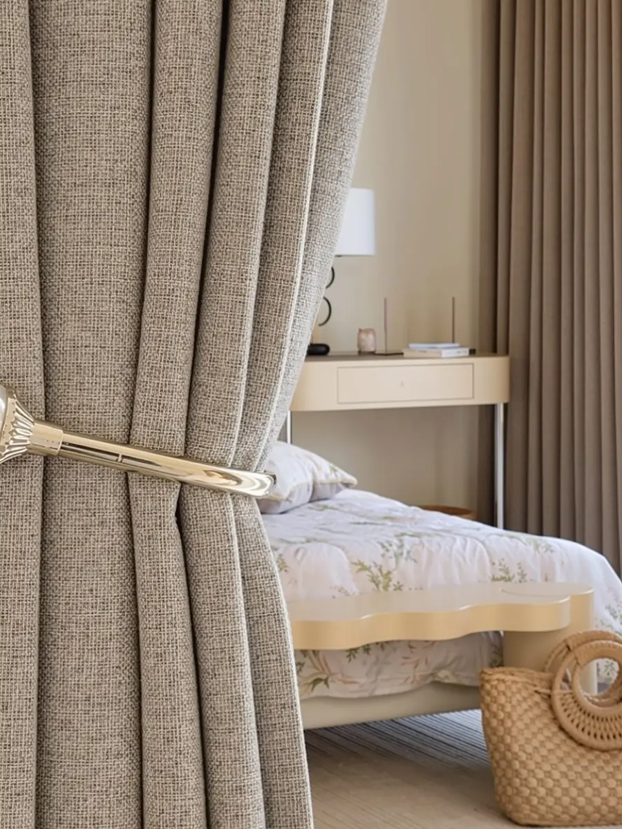
The Heavyweight Drape: Custom Double-Layered Linen Curtains — Search: “Custom Heavyweight 100% Linen Curtains Hook Top“
Why I chose this: These offer the “pinch pleat” and weight needed to achieve the High and Wide rule effectively.
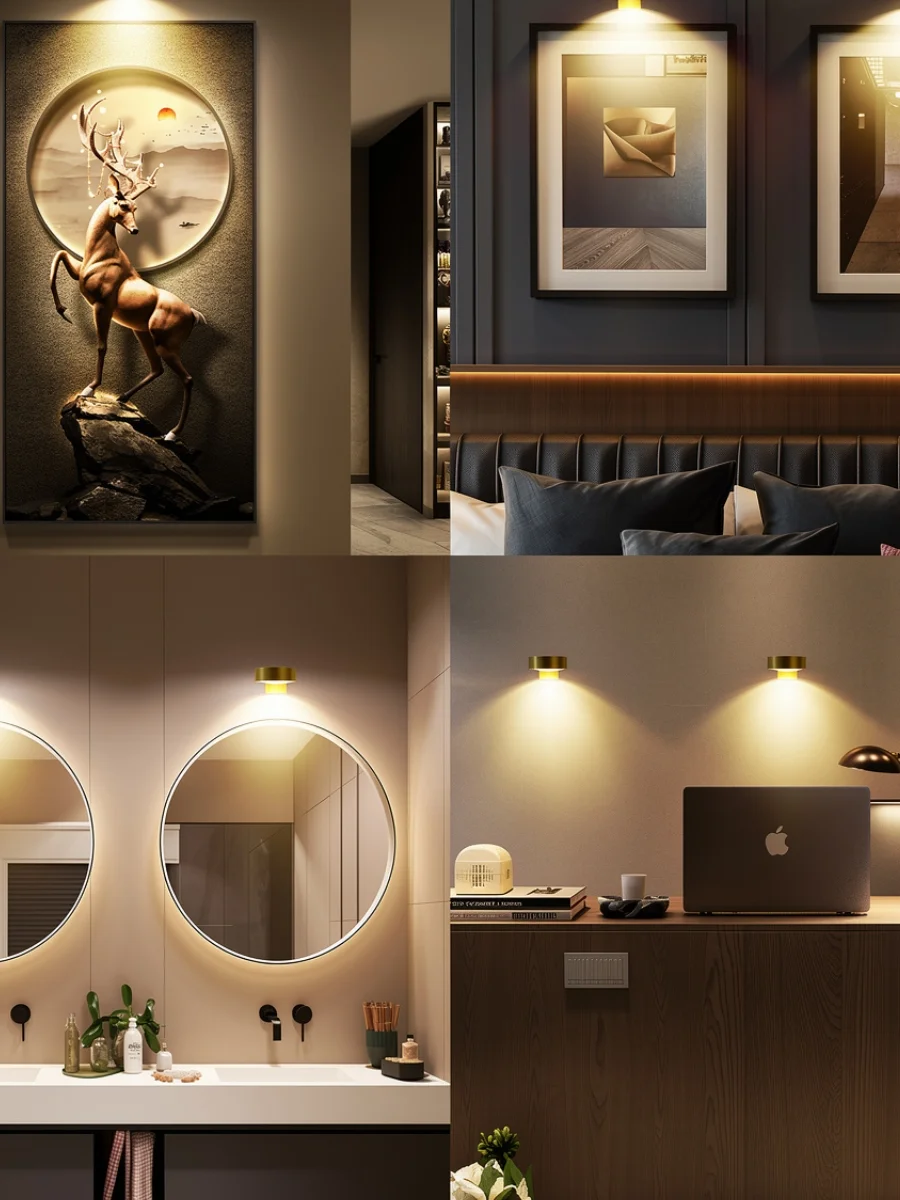
The Gallery Light: Brass Rechargeable LED Art Light — Search: “Wireless Dimmable Art Light Antique Brass“
Why I chose this: It highlights your art at the 57-inch level without the need for messy wires or expensive electricians.
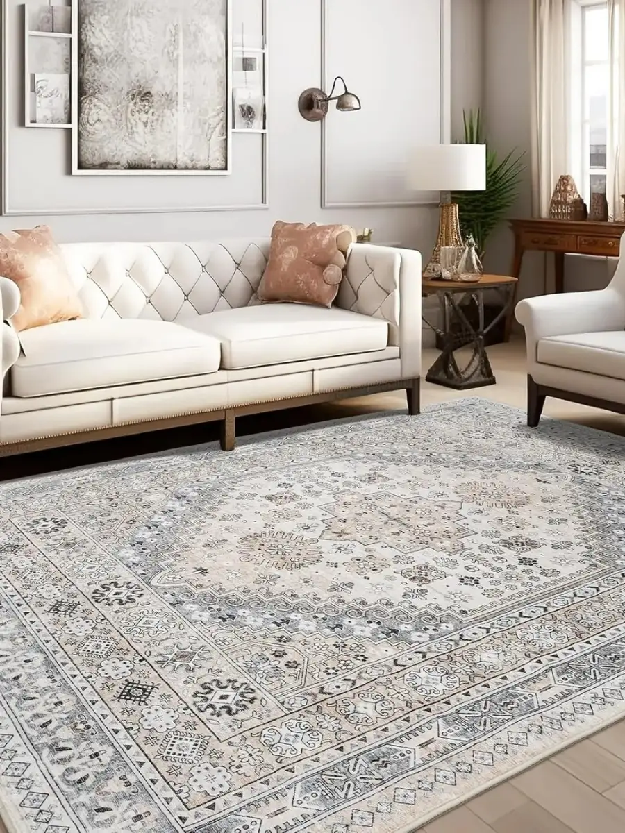
The “Anchor” Rug: Distressed Vintage Persian Style Rug — Search: “Large Low Pile Distressed Medallion Rug“
Why I chose this: Large sizes are affordable here, allowing you to follow the Legs On rule without overspending.
When setting up your layout, choosing the right textile can anchor the whole space. If you want a luxury aesthetic without the price tag, see our comprehensive Joydeco rugs review to find out how these machine-washable prints perform in real spaces.
The 70/30 Style Mix: Avoiding the "Furniture Showroom" Look
A common mistake in affordable luxury interior design is buying everything from a single store or in one uniform style.
Early in my journey, I furnished a whole room in “Mid-Century Modern,” and it felt like a cold museum set rather than a lived-in home.
To solve this, I now strictly apply the 70/30 Style Rule, one of my favorite Affordable Luxury Interior Design Rules for creating visual tension.
As noted by design authorities like Architectural Digest, mixing periods is what creates the “collected” look of a truly high-end home.
How to Balance the Mix
- 70% (The Foundation): Your primary style—for example, Warm Minimalism.
- 30% (The Contrast): An opposing style, such as Vintage European or Industrial Chic.
- The Result: This intentional “clash” makes budget-friendly pieces look like expensive, curated antiques.
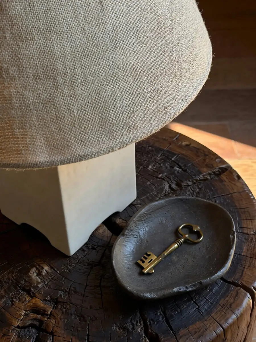
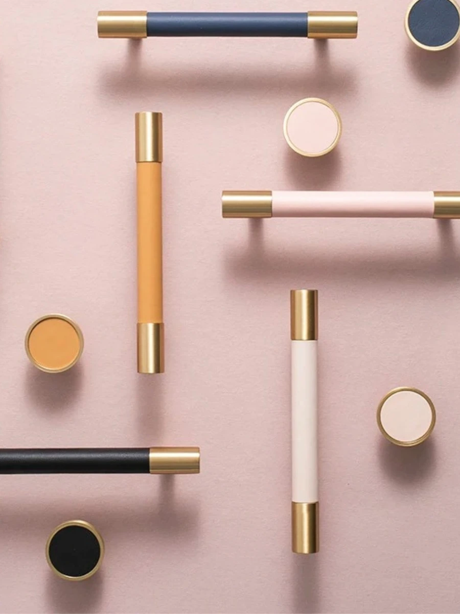
The "Jewelry" of the Home: High-Impact Hardware Upgrades
Choosing the Right Finish for 2026
| Hardware Type | Budget “Basic” Look | Affordable Luxury Upgrade |
|---|---|---|
| Kitchen Pulls | Thin Brushed Nickel | Solid Brass Knurled Bars |
| Bedroom Knobs | Flat Silver Discs | Cognac Leather or Stone Knobs |
| Door Handles | Standard Round Chrome | Lever-style Matte Black or Bronze |
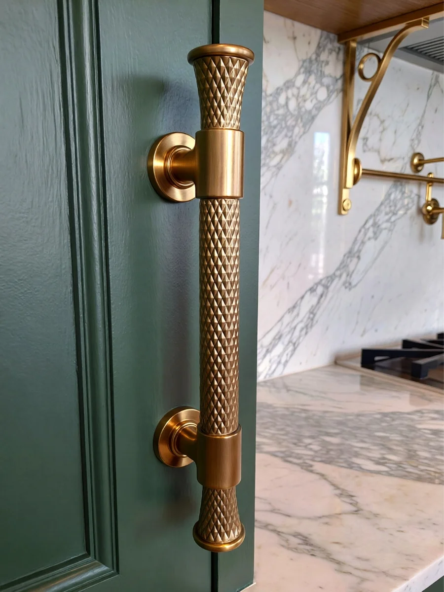
Shop the Look: The Hardware & Style Edit
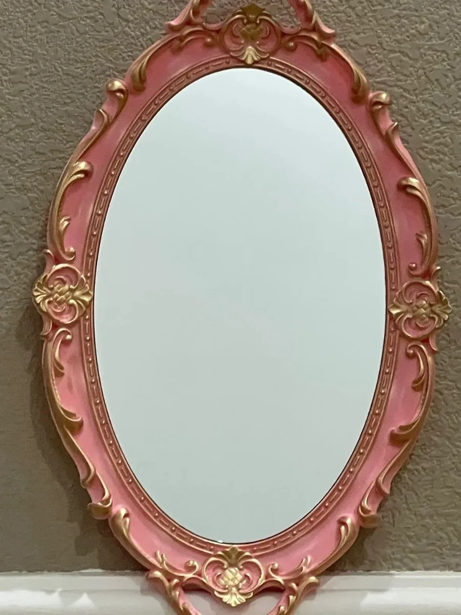
The 30% Vintage Touch: Ornate Antique Gold Resin Mirror — Search: “French Vintage Gold Decorative Wall Mirror“
Why I chose this: This is the perfect “30% contrast” piece to lean against a wall in a modern room to create visual depth.
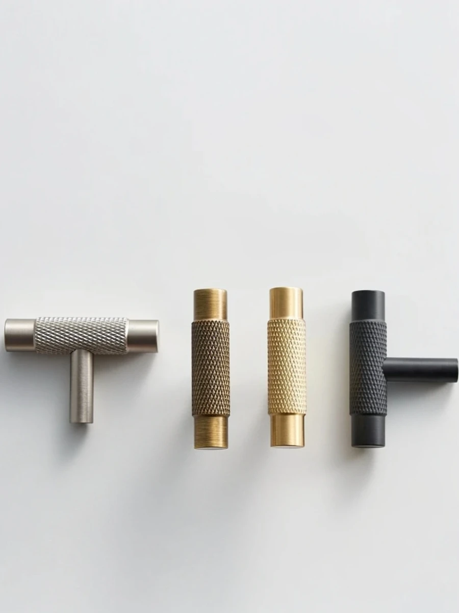
The Luxury Hardware: Solid Brass Knurled Furniture Handles — Search: “Solid Brass Knurled Kitchen Cabinet Pulls“
Why I chose this: These have the heavy hand-feel and diamond-cut texture that mimics $50 designer handles for a fraction of the cost.
The Tactile Accent: Genuine Leather Wardrobe Pulls — Search: “Handmade Leather Furniture Handles Brass Nut“
Why I chose this: Adding organic materials like leather is a core Affordable Luxury Interior Design Rule for adding “warmth” to closets or dressers.
The Rule of Three: Mastering the Art of the Vignette
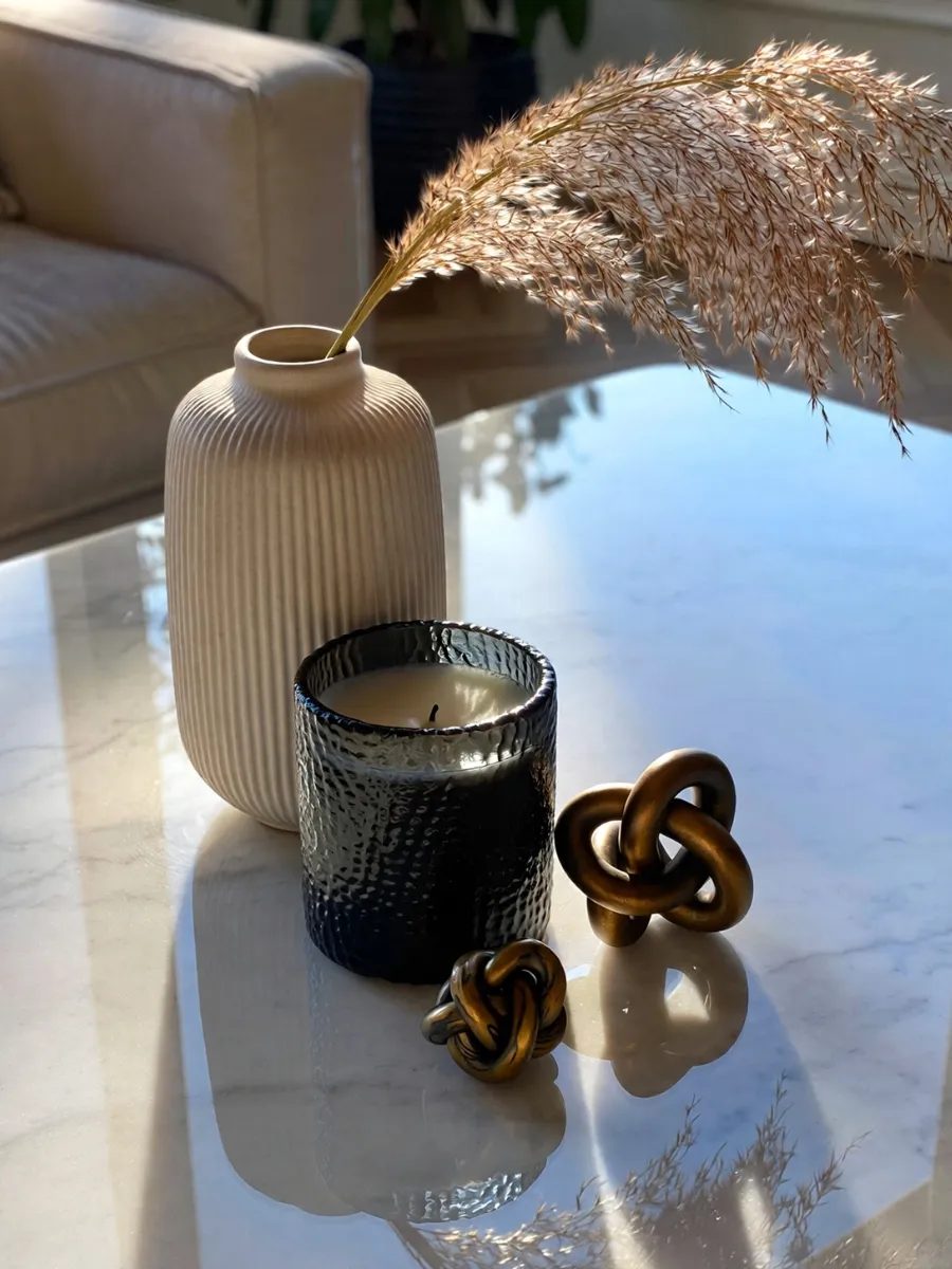
How to Build the Perfect Trio
- The Anchor: A tall sculptural vase or a large piece of art to draw the eye upward.
- The Weight: A medium-sized leather-bound book or a heavy stone tray to ground the group.
- The Detail: A small brass candle holder or organic wood object to add a tactile finish.
The Lighting Layer Rule: Eliminating the "Big Light"
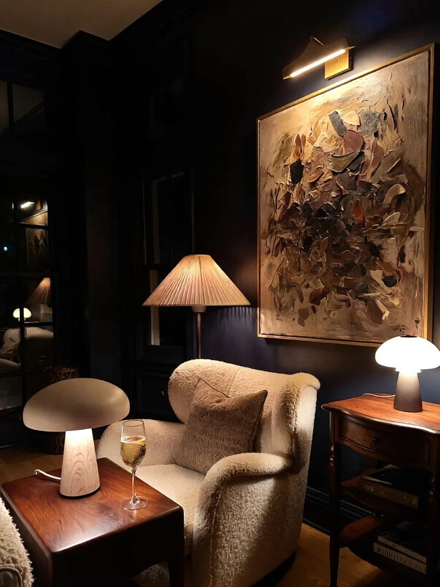
The Three Essential Layers
- Ambient Lighting: Your soft, overall glow, achieved through floor lamps and wall sconces.
- Task Lighting: Functional light for reading or cooking, such as a sleek brass desk lamp. (Tip: See how a sculptural walnut wooden book lamp makes the perfect cozy companion for a task-lit reading nook).
- Accent Lighting: The “secret weapon” used to highlight architectural details, art, or indoor plants.
I always recommend using warm-toned bulbs (2700K to 3000K) to ensure your high-end textures look rich and inviting rather than sterile or “cheap.”
Lighting Layer | Purpose | Affordable Luxury Tool |
|---|---|---|
| Ambient | Overall Vibe | Large Linen Shade Floor Lamp |
| Task | Functional | Adjustable Brass Reading Lamp |
| Accent | Visual Drama | Wireless Magnetic LED Spotlights |
Shop the Look: The Mood & Detail Edit
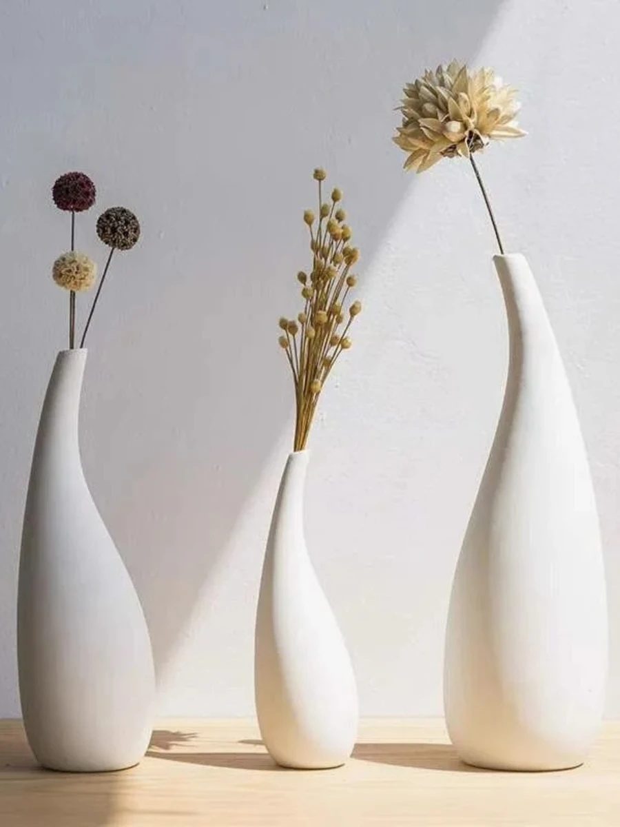
The Trio Foundation: Scandi-Style Matte Ceramic Vase Set — Search: “Set of 3 Minimalist Matte Vases Different Heights“
Why I chose this: These come pre-sized in a trio, making it effortless to follow the Rule of Three perfectly.
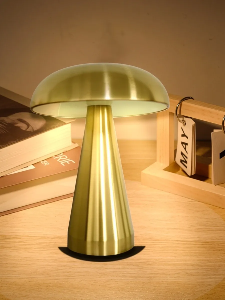
The Cordless Luxury: Rechargeable Metal Mushroom Table Lamp — Search: “Cordless LED Table Lamp Mushroom Metal Matte“
Why I chose this: This is the ultimate designer home hack for adding a lighting layer to a shelf or table without ugly cords.
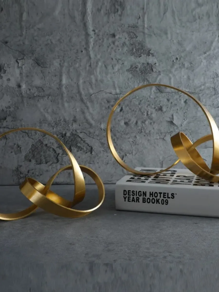
The Sculptural Accent: Solid Brass Knot Decorative Object — Search: “Modern Brass Knot Sculpture Home Decor“
Why I chose this: Every high-end vignette needs a “heavy” metallic element; this provides the tactile luxury of solid metal.
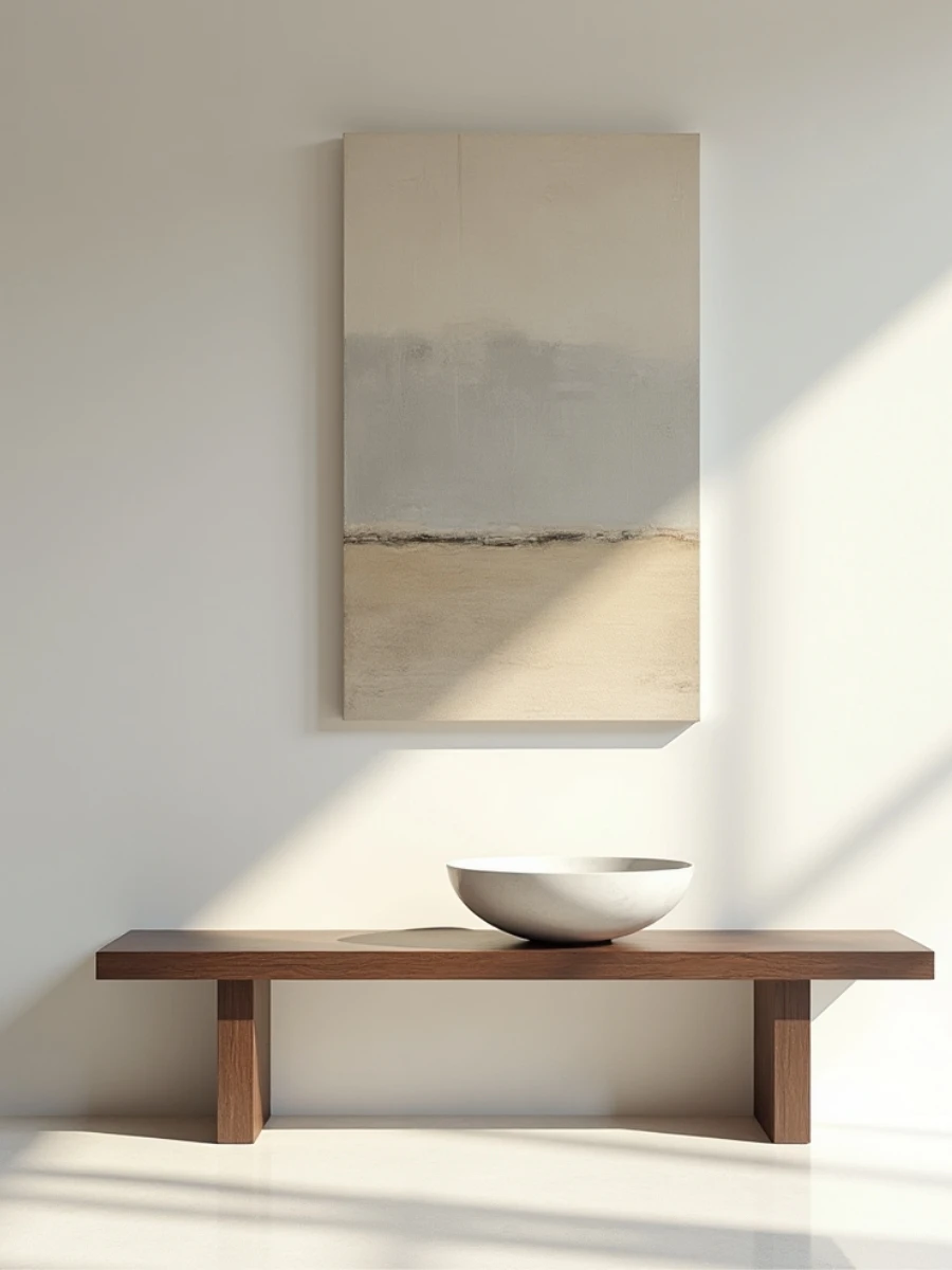
The Power of Negative Space: The "Quiet Luxury" Secret
Letting the Room Breathe
WHAT TO READ NEXT: Achieving perfect focal balance doesn’t stop with your furniture arrangement. If you are struggling with a massive, empty wall above your seating layout, put these symmetry concepts into immediate action by reading our step-by-step handbook on choosing a Blank Wall Solution. You will learn exactly how to balance multi-print framing sets, choose gallery scales, and establish luxury visual anchors above your sofa or bed.
FAQ: Common Affordable Luxury Questions
To help you troubleshoot your space, I’ve answered the most common questions I receive about implementing these Affordable Luxury Interior Design Rules.
Can I mix metal finishes in the same room?
Yes! In fact, mixing metals makes a room look more collected and high-end. I recommend choosing one “dominant” metal (like 70% Antique Brass) and one “accent” metal (like 30% Matte Black).
How do I choose the right rug size for a small living room?
Never go smaller than an 8′ x 10′. A small rug makes a small room look even smaller. Go as large as the room allows to “push” the walls out visually and increase perceived value.
What is the best light bulb for a luxury vibe?
Always choose bulbs labeled “Warm White” with a temperature of 2700K to 3000K. Avoid “Daylight” bulbs (5000K+), as they create a cold, sterile, and “cheap” atmosphere.
Conclusion: Your Journey to a High-End Home
The Affordable Luxury Master Checklist
- Color: Does your room follow the 60-30-10 ratio?
- Curtains: Are they hung High and Wide (near the ceiling)?
- Rugs: Are all front furniture legs sitting on the rug?
- Art: Is the center of the frame 57 inches from the floor?
- Styling: Have you grouped your decor in threes?
- Lighting: Have you layered your light and turned off the “big light”?
- Hardware: Have you upgraded to solid brass or knurled handles?
With elegance,
Bella
