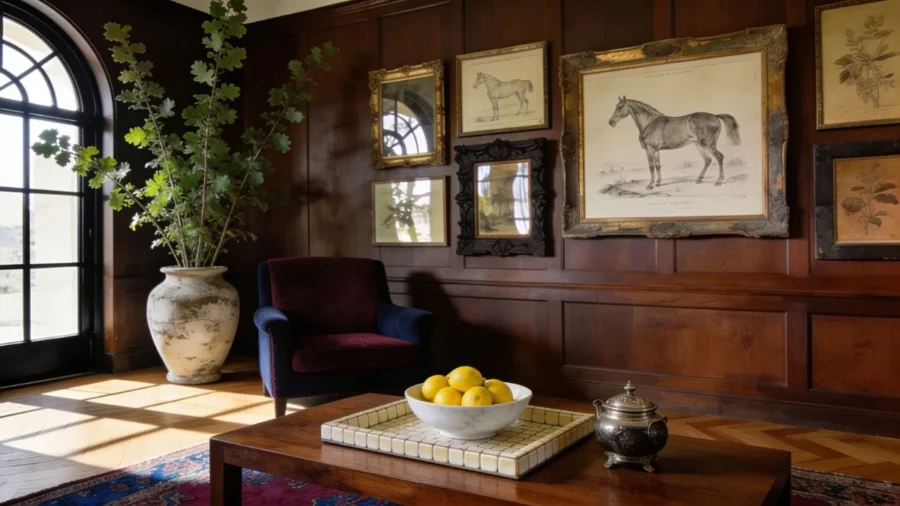
Have you ever walked into a house that felt deeply welcoming, calm, and expensive without feeling flashy?
That classic, lived-in comfort comes from mixing items with actual history and physical weight.
Today, I’m breaking down how to use Regina Andrew Old Money Home Decor pieces to anchor that elevated, timeless feel in your own space.
Disclosure: This post contains affiliate links. I may earn a small commission at no extra cost to you.
Most average rooms feel a bit flat not because you spent too little money, but because the space lacks physical weight.
I used to buy endless small knick-knacks trying to fill empty corners, but it only made my first apartment look messy.
True elegance is about choosing items that look like they have a past, a clear purpose, and a heavy presence.
If your budget is tight right now, please do not think you are priced out of this aesthetic.
Design rules are universal, but I’ve found that adding a piece from Regina Andrew is a great shortcut to anchoring that old money home decor look.
They are investment pieces, but the heavy, raw materials instantly give a regular room a permanent, grounded feel.
However, if you are blending high and low, you can take these exact same structural styling formulas to your local thrift store, flea market, or weekend estate sale.
The secret is training your eye to ignore trendy shapes and search purely for raw ingredients.
Look for tarnished solid brass candlesticks, heavy stoneware crocks, marble cheese boards, or real wood boxes.
Whether you are saving up for investment pieces or hunting through thrift stacks, the goal remains the same: replacing hollow plastic with genuine weight.
If you want to dive deeper into the overarching philosophies of scaling a space beautifully, you can read my master guide on the foundational rules of affordable luxury interior design to see how math creates visual prestige.
Jump Ahead to the Styling Steps
- Why Average Living Rooms Lack a High-End Aesthetic
- Timeless Hues: The Old Money Color Palette
- High-End Furniture Layout Rules for a Timeless Living Room
- Step 1: Elevating Storage with Regina Andrew Old Money Home Decor
- Step 2: Building Scale with Regina Andrew Accents
- Step 3: Expanding the Perimeter with Regina Andrew Wall Frames
- Step 4: Blending Vintage Patina with Regina Andrew Old Money Home Decor
- The High-End Curation Checklist
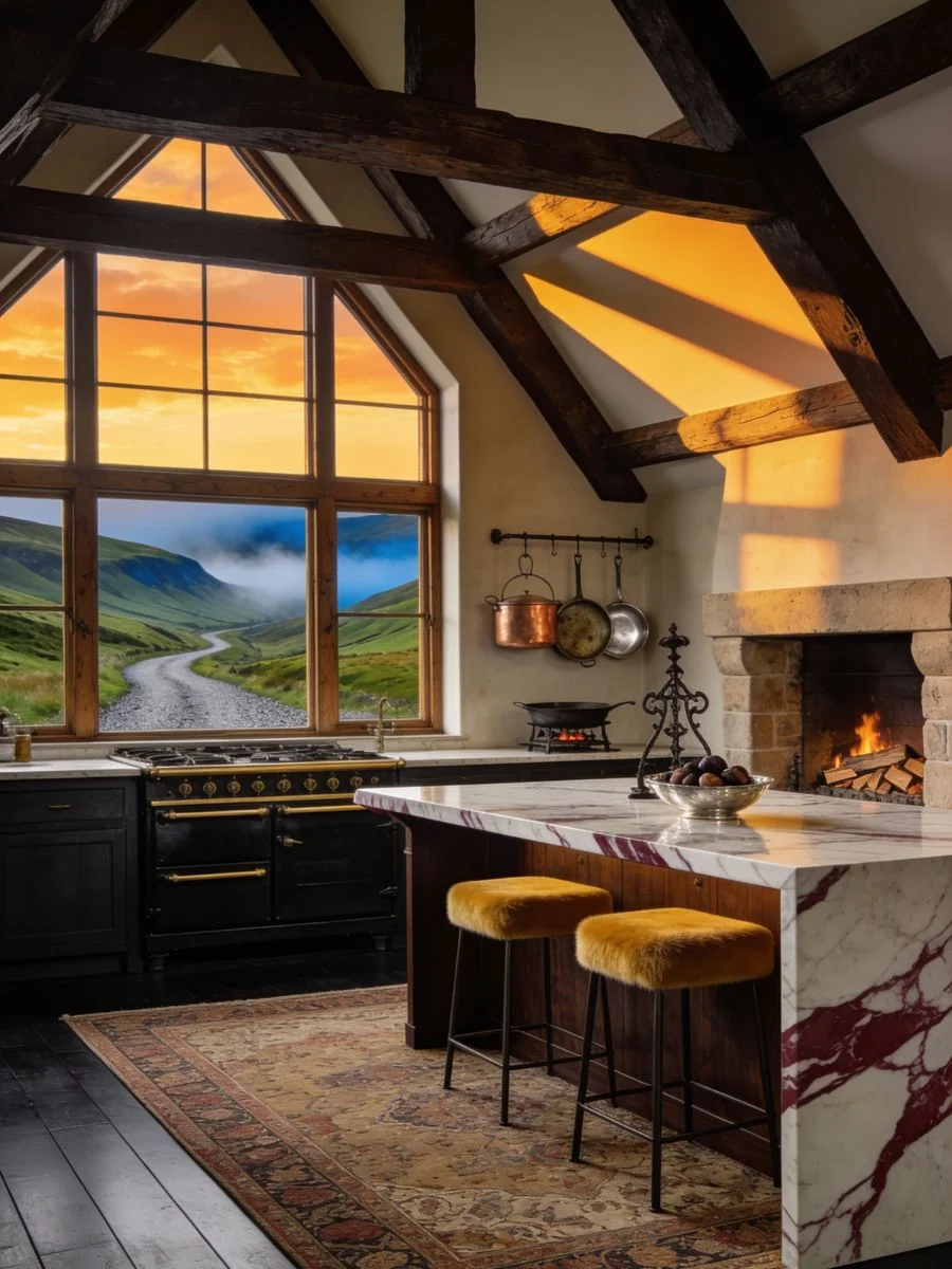
Why Average Living Rooms Lack a High-End Aesthetic
The biggest roadblock to a high-end look is what I call “the showroom trap.”
When you buy all your furniture and accents in a single weekend from a big-box store, the room lacks contrast.
Everything features the same smooth, manufactured texture and lightweight feel.
If a decorative piece is light enough to blow away with a stray breeze, our brains subconsciously register it as temporary clutter.
To fix this, you have to look at your surfaces the way a classic curator does.
We need to balance the flat, hard surfaces of your standard furniture with pieces that possess real physical weight and varied textures.
This creates a beautiful friction between materials—like placing cold stone directly against a thick, cozy woven textile.
It is a simple shift from merely buying random items to intentionally zoning your spaces.
When you get the foundational layers right, even the most basic rental apartment instantly feels permanent and grounded.
I realized my own living room felt like a temporary waiting area simply because I had zero heavy materials anchoring my eyes to the main surfaces.
Quick Material Guide for a High-End Vibe
| High-End Material | Why It Works | What It Replaces |
| Authentic Bone & Marble | Cold to the touch, heavy visual presence, unique natural variations. | Hollow resin and shiny plastic finishes. |
| Cast Aluminum & Iron | Rough, handcrafted textures that catch shadows beautifully. | Smooth, spray-painted lightweight metals. |
| True Vintage Paper | Natural sepia tones and rough edges that add historical character. | Bright white, mass-printed fake book covers. |
Timeless Hues: The Old Money Color Palette
The old money aesthetic utilizes a neutral foundation of warm ivory, cream, and soft beige to create a sense of space.
It is accented with historic colors such as British racing green, deep navy, and muted burgundy, paired with dark wood and brass for a grounded look.
High-End Furniture Layout Rules for a Timeless Living Room
Before you can stack trays on a table, you have to fix the actual bones of the room.
Pushing all your furniture against the walls is a classic mistake that leaves a cold, empty vacuum in the center of the space.
High-end rooms feel intimate because the main layout floats.
Try pulling your sofa and armchairs just six inches away from the drywall to create a dedicated conversation pocket.
This simple gap instantly tricks the human eye into believing the room has grand, expansive architecture.
Next, address the flat surfaces of your walls.
Smooth, bare drywall instantly ruins an old money aesthetic, no amount of expensive trinkets can hide it.
Adding simple, inexpensive DIY picture-frame molding creates structural depth by catching natural daylight and casting rich shadow profiles.
Paint the trim the exact same color as your walls for a seamless, tailored finish that anchors the entire room.
Step 1: Elevating Storage with Regina Andrew Old Money Home Decor
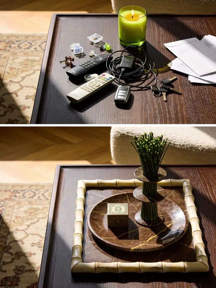
The fastest way to make a room look cluttered is to leave your daily necessities scattered across an open tabletop.
When keys, mail, and television remotes sit loose on a bare counter, your eyes register that space as chaotic.
High-end design solves this by simply containing the mess.
By grouping loose, ordinary items inside a clear, physical boundary, you trick the brain into seeing a thoughtful display instead of a daily mess.
When studying how master designers construct these layouts, I often look at iconic European design houses and bespoke British studios.
Names like Pierre Yovanovitch or Studio McGee excel at making rooms feel large, while historic British brands like Plain English and Robert Kime are absolute masters at styling surfaces that look collected over lifetimes.
While those historic design houses offer incredible inspiration, finding their exact custom pieces can be nearly impossible for everyday styling.
When I am not hunting through local flea markets, I look for modern brands that use those same heavy, traditional materials to make a home feel established.
That is why I frequently turn to accessories from Regina Andrew when I’m putting together a real room design.
They build with authentic, cold-to-the-touch marble, hand-inlaid bone, and thick cast metals that mass-market storefronts simply cannot replicate.
The Base Layer: Setting the Boundary
To start a surface arrangement, you need a wide, flat foundation that acts as a frame for your smaller items.
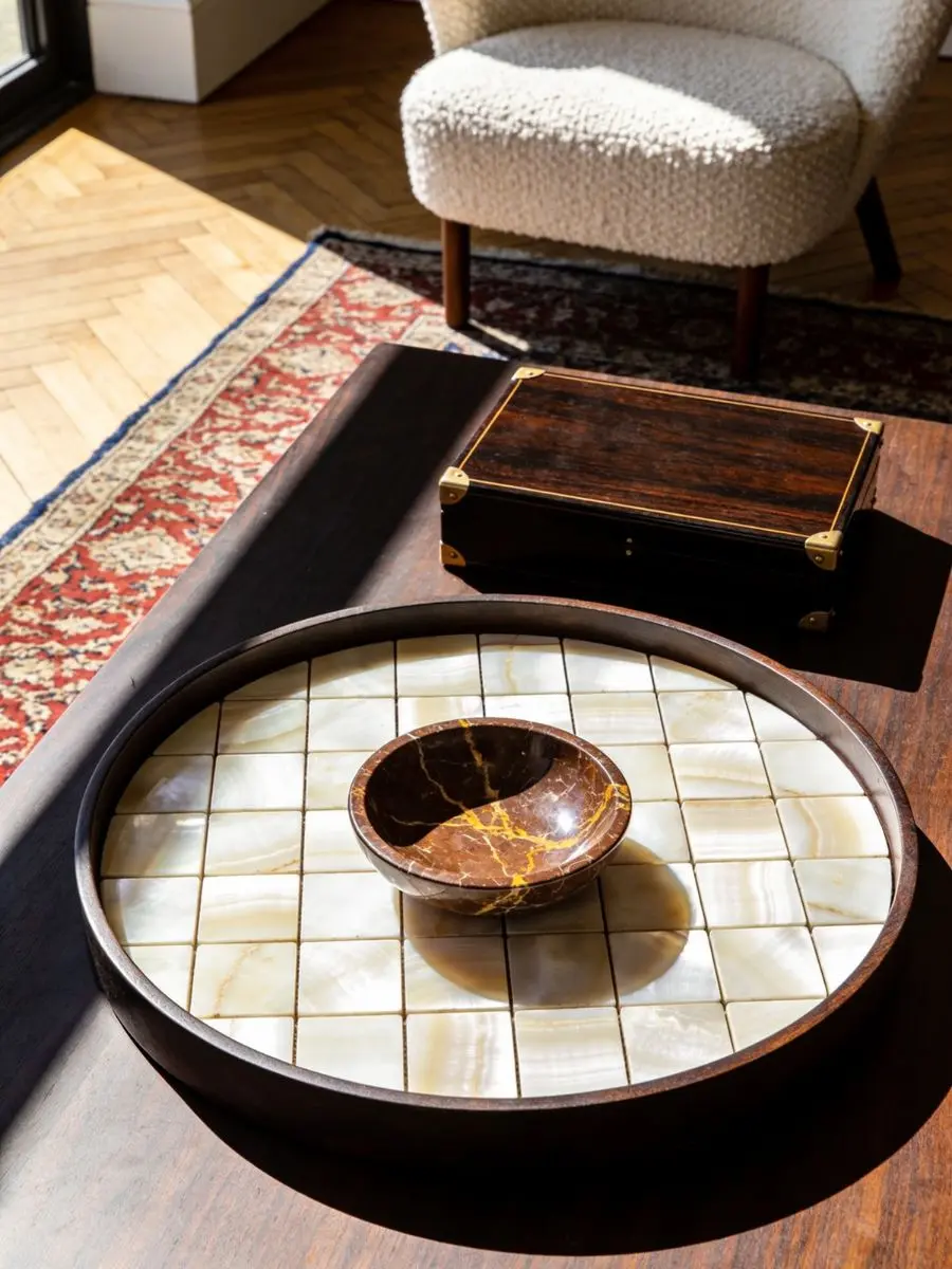
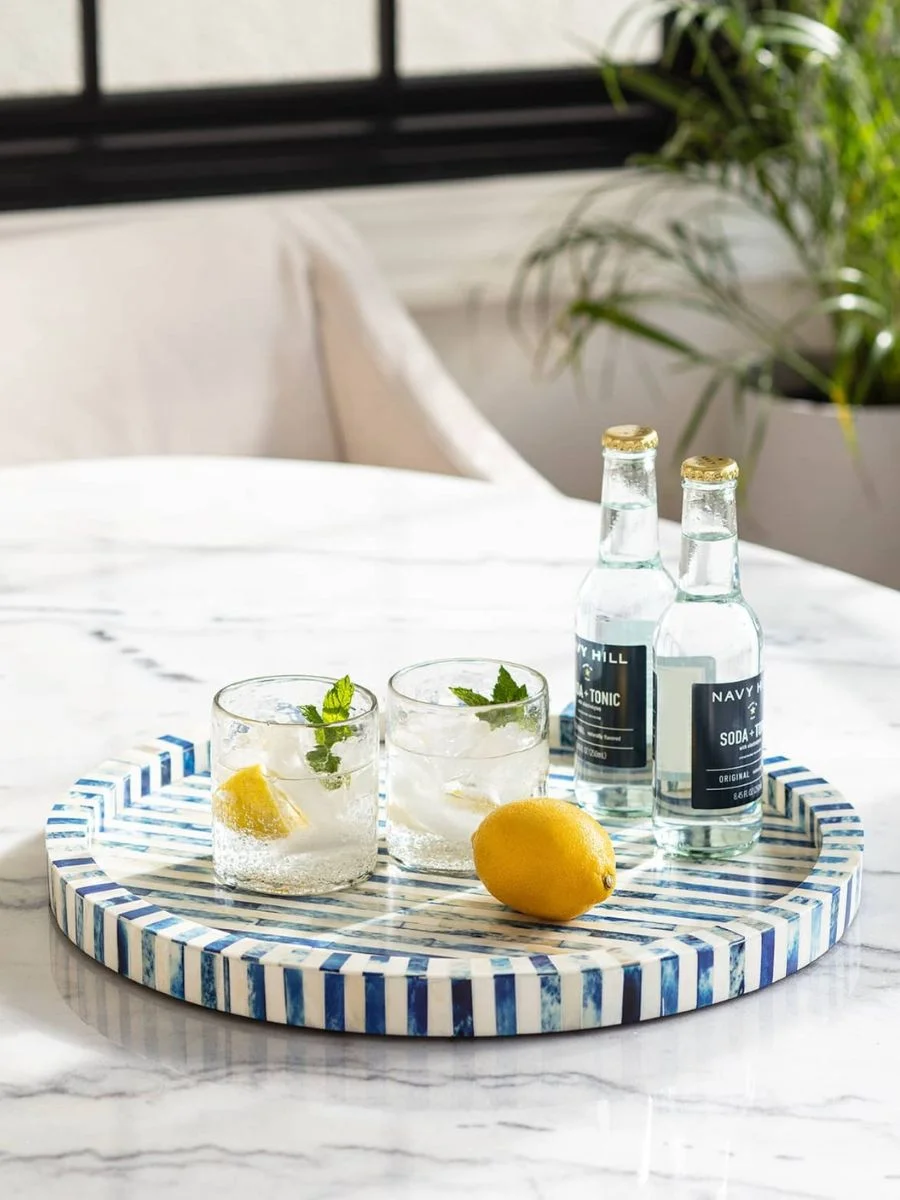
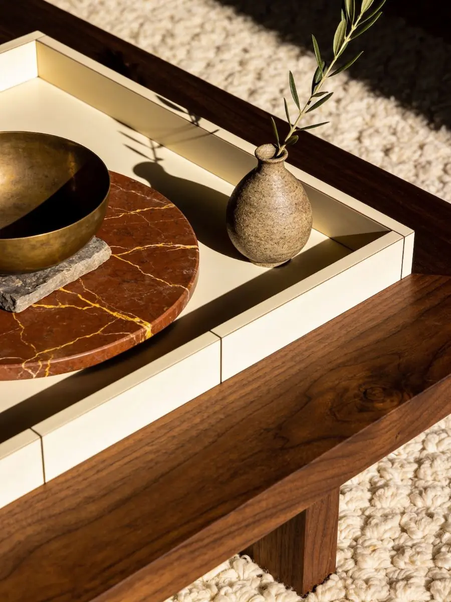
The Bone & Indigo Tray Round is a great example of a piece that defines a clear boundary on a large coffee table or ottoman.
Crafted from inlaid natural and indigo-dyed bone tiles, this tray adds a rich, mosaic-like texture, while its round shape breaks up rigid, square furniture layouts.
Placing this base first defines a clear zone for styling, ensuring smaller items don’t clutter the surface.
My preference is using round trays on square tables because the contrasting shapes instantly make a rigid furniture layout look more dynamic.
Once this wide base is down, you have a designated zone to start layering your smaller, high-density objects without making the table look overcrowded.
The Heavy Center: Stacking for Depth
Once your tray is in place, you need an accessory inside it that offers a sharp change in color, material, and height.
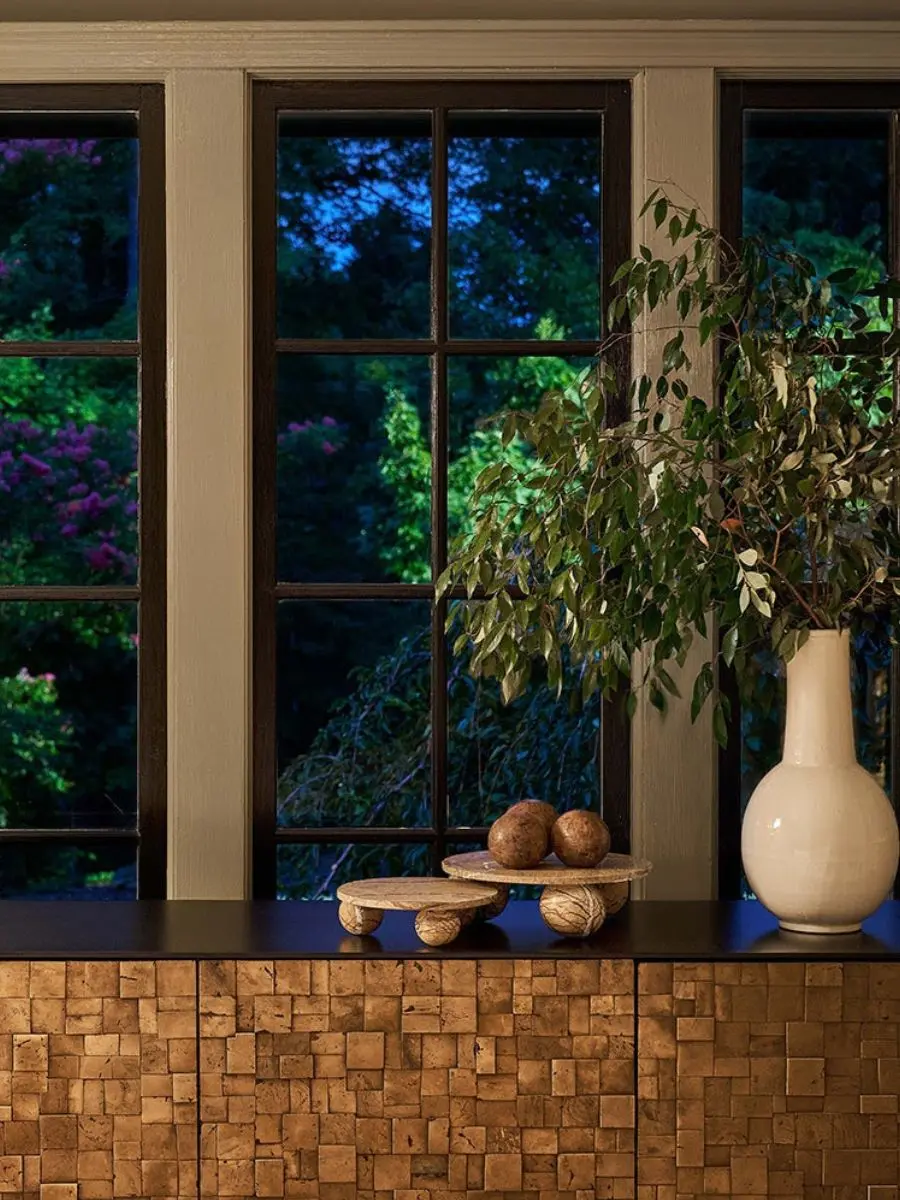
Placing the Marlow Marble Plate Small directly inside or slightly overlapping your base tray introduces a cold, unyielding stone texture.
This solid brown marble plate weighs nine pounds despite its compact size, giving it the substantial physical presence needed to ground the display.
A heavy stone dish like this works perfectly to corral small items, or it can function as a pedestal to raise a small decorative object.
On top of your stone layer, a structural element can introduce both pattern and personality.
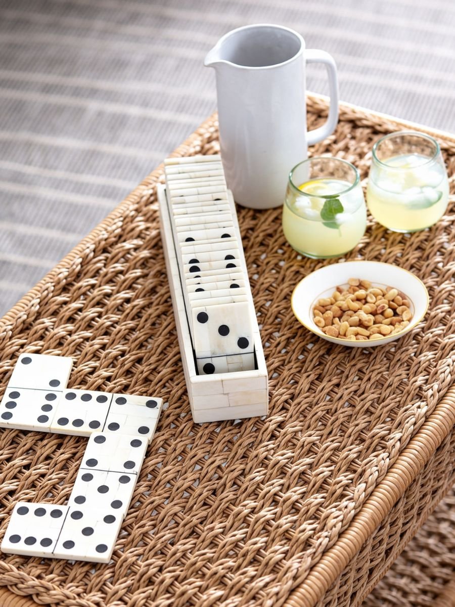
The Royal Dominos Set is perfect here because it functions as an elegant decorative box while housing an actual game to entertain guests.
The case is built from hand-inlaid bone tiles that form a crisp mosaic look, which ties back beautifully to the natural materials used in your base tray.
How to Layer the Surface Pieces
When I group these items together, I always follow a simple styling order: start with the wide patterned tray, layer the heavy contrasting marble plate inside it, and top it off with the structured bone game box. This tiered setup naturally creates depth while keeping your daily tabletop mess completely hidden.
Bringing the Texture to the Floor
To finish your functional layer, you must carry that same high-density texture off your tabletops and down to the floor lines.
Leaving a bare floor space next to a large couch or an entryway bench can make the lower half of the room feel cold and empty.
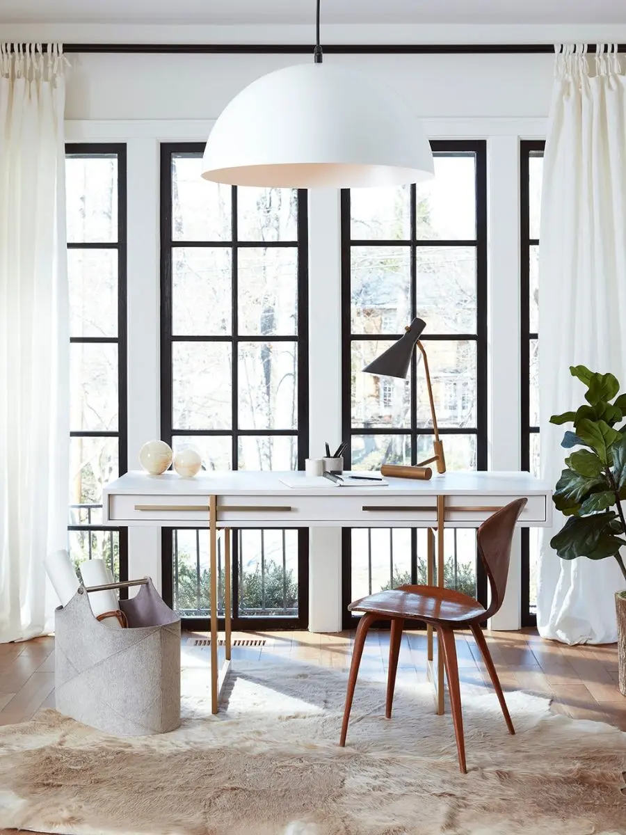
Placing the Andres Hair on Hide Basket in an open corner or beside an armchair immediately balances the room’s visual weight.
This massive storage piece weighs twenty pounds and is wrapped in genuine grey hair on hide, offering an incredible amount of tactile texture.
It easily conceals large, messy items like extra blankets or toys while standing completely alone as a sculptural work of art.
My experience has shown that adding one large, textured basket to the floor does more to ground a room than buying three small side tables.
A Quick Note on Care and Investment
While authentic materials like stone, bone, and leather never look dated and offer incredible weight to anchor your surfaces, they do require a bit of extra mindfulness. Keep in mind that natural leather needs gentle cleaning, and you’ll want to place heavy stone pieces down carefully if you are styling them on top of glass tables.
Step 2: Building Scale with Regina Andrew Accents
A common issue that makes an average room look cheap is decorating entirely with tiny, lightweight trinkets.
When you scatter dozens of small knick-knacks across your tables and shelves, the space quickly feels messy rather than intentional.
High-end design leaves breathing room: one large, heavy object does the visual work of ten tiny items.
We need to build a sense of scale by mixing heavy horizontal anchors with tall vertical elements that pull the human eye up toward the ceiling.
Tabletop Anchors: Designing the Coffee and Dining Surfaces
To break up a flat, boring tabletop, you need an accessory that acts as a strong, dark center point.
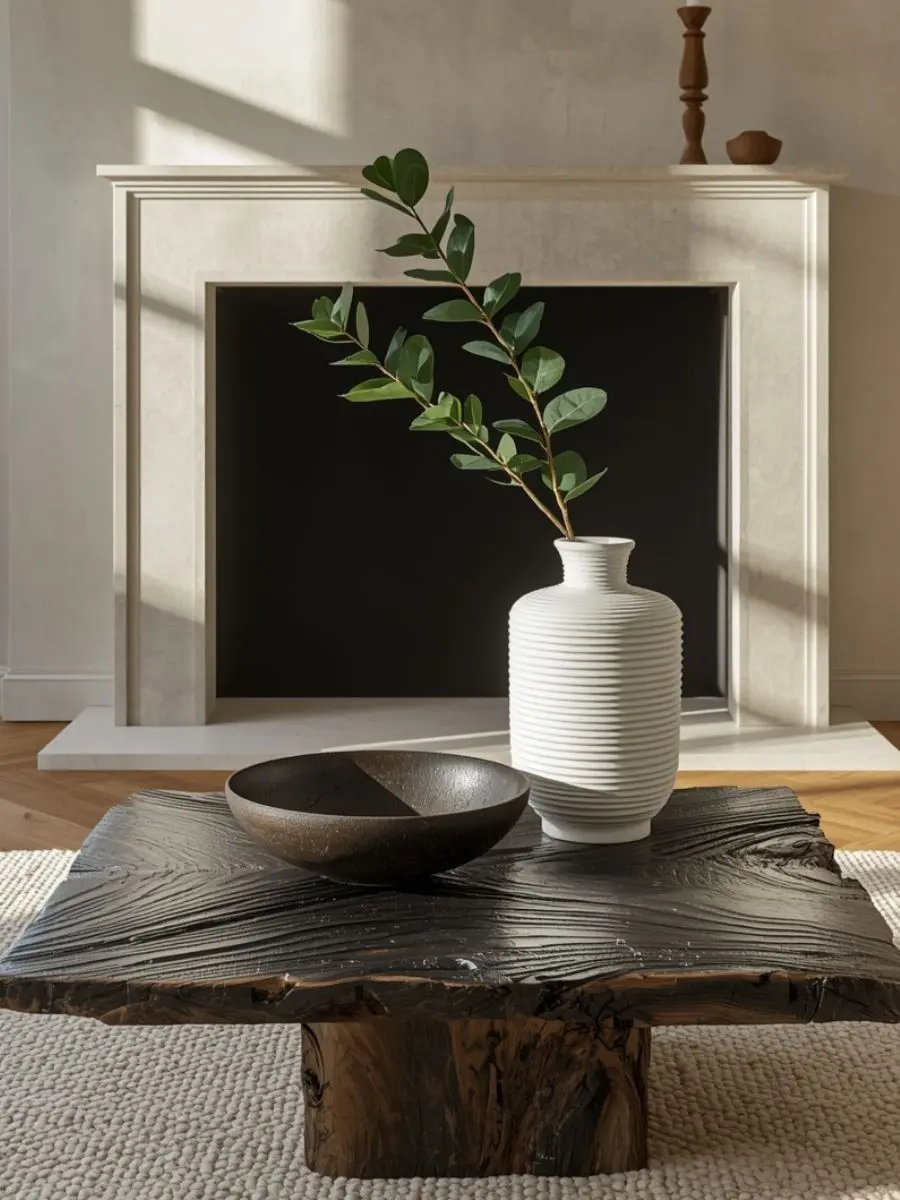
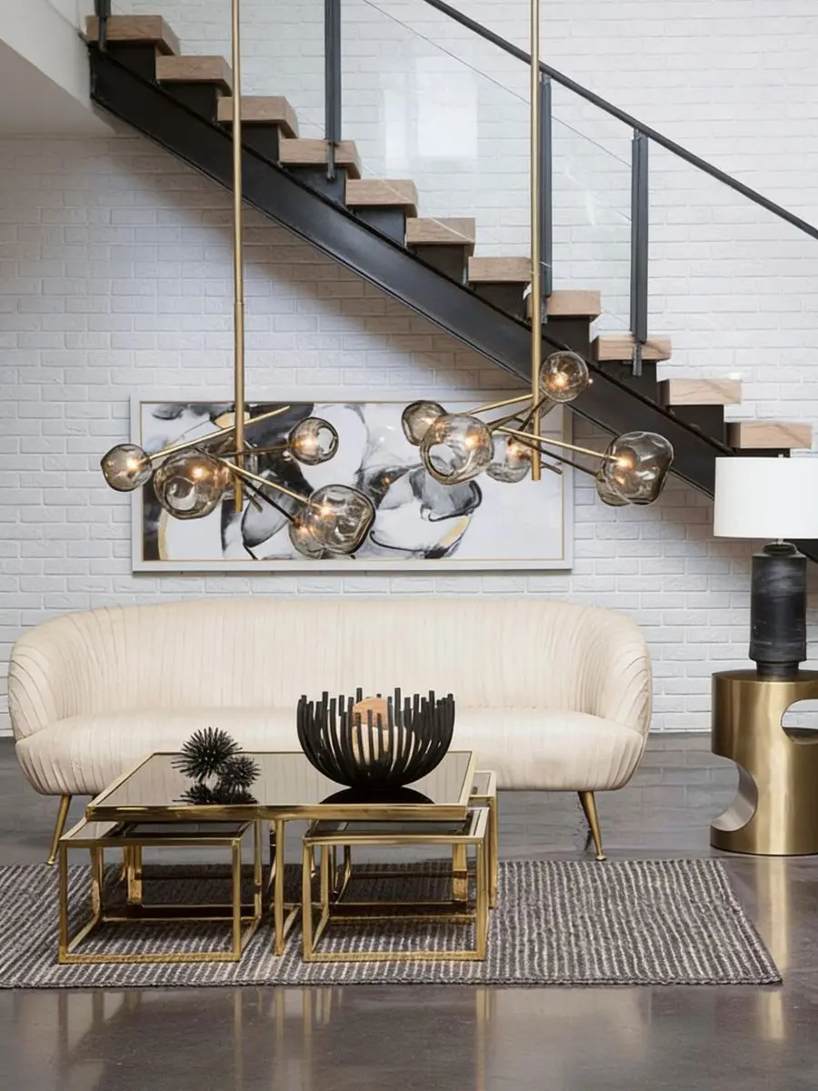
The Webbed Bowl Circle is a perfect example of a piece that holds a room’s visual center.
Weighing an impressive twenty-four pounds, this massive blackened iron bowl brings raw, structural drama to the middle of a coffee table or dining space.
Its open, sculpted webbed pattern allows it to stand completely empty as a bold piece of art, or you can use it to hold smaller organic items like dried seed pods or stone spheres.
Incorporating a dark metal accent like this instantly stops a neutral room from looking washed out.
The Vertical Lift: Contrast and Greenery
Once you have a dark, heavy anchor on your table, you need to contrast it with something bright and tall.
Placing the Caspian Ceramic Vase next to or slightly behind a dark iron piece creates an instant balance in color and texture.
This vase features thick, texture-forward ceramic ridges that look like hand-carved artwork.
Its chalky white finish catches natural light beautifully, and its eleven-inch height makes it ideal for holding tall, fresh greenery branches.
Long stems gathered directly from nature work significantly better than small floral arrangements, as they automatically draw the gaze upward to fake a much grander architecture.
Shelf Structure: Bringing Contrast to Bookshelves
This same need for height and shape contrast applies directly to your open built-ins and shelving units.
If every item on your shelf is a straight, linear line, the display looks rigid and flat.
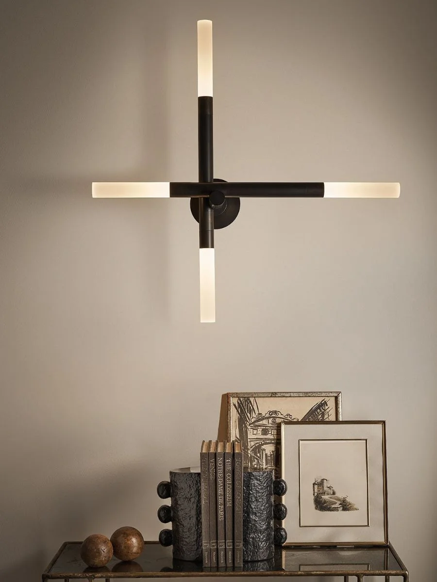
You can break up those harsh lines by introducing the Sanya Bookend Set.
Cast from solid aluminum, these heavy bookends bring a bold, handcrafted feel with their distinctive, paper-mache-inspired texture.
Their deep dark curves create a striking visual stop against the sharp square borders of your books.
I like to place these heavy metal shapes directly next to soft textures like a natural linen armchair to create a more balanced, comfortable visual contrast.
Furniture Accents: Softening Built-In Materials
After organizing your heavy metal and ceramic pieces, it is vital to balance the hard textures with soft materials to maintain a welcoming atmosphere.
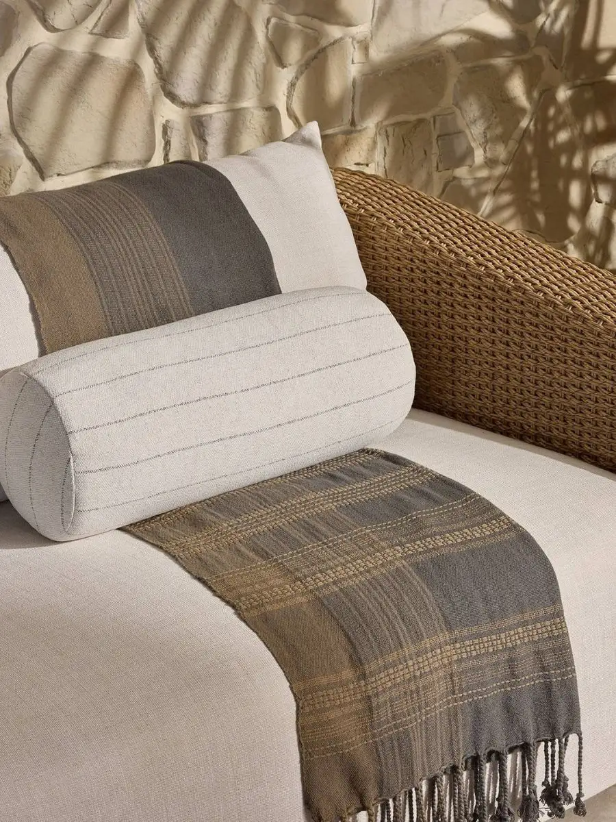
Draping the Aldama Outdoor Bolster Pillow across a nearby bench or armchair introduces a relaxed Mediterranean feel.
Its simple, tonal stripes offer a quiet pattern that contrasts gracefully with the rigid metals sitting on your shelves.
A Quick Tip for Large-Scale Accents
While massive iron or ceramic pieces create an instant focal point and save you from dusting a million tiny knick-knacks, remember that they do require a sturdy table surface. Because these statement shapes carry real physical weight, take your time placing them so they have plenty of breathing room to stand out.
Step 3: Expanding the Perimeter with Regina Andrew Wall Frames
Blank drywall is one of those subtle mistakes that makes an average room feel temporary, empty, and cold.
When you leave your walls completely bare—or hang a single, tiny picture frame right in the middle of a massive wall—the space loses its sense of proportion.
High-end design treats walls as a cozy background frame that encloses the room and pulls the layout together.
To achieve this, you need to use pieces that reflect natural light and introduce real, three-dimensional depth instead of flat, paper prints.
Planning the perimeter of a room meticulously does more to make it feel expensive than swapping out the actual furniture.
If you are looking for structural ways to open up your boundaries, it helps to read my guide on How to Layer Lighting: 7 Elegant Looks for Your Home to see how shadows alter your walls.
The Light Anchor: Bouncing Natural Glare
Every major wall arrangement needs a strong centerpiece that anchors the layout and makes the room feel much larger.
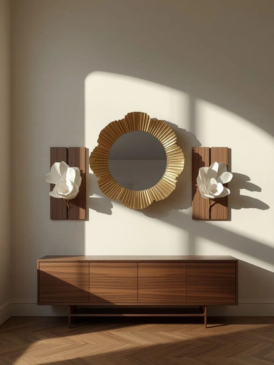
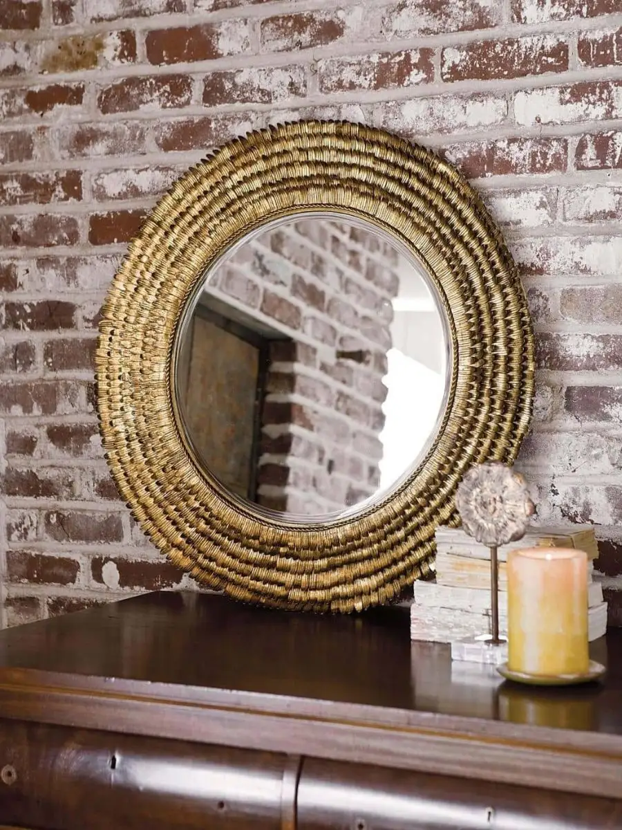
The Petal Mirror Small functions perfectly as a main visual anchor above a living room fireplace or a long entryway console table.
This classic round mirror is bordered by heavy, layered steel petals finished in a warm gold leaf, bringing a bright metallic pop to flat walls.
Its premium beveled glass center catches and bounces natural light, which instantly opens up narrow hallways and makes small rooms look twice as wide.
Mounting a reflective frame directly across from an open doorway pulls the outdoor greenery right onto the wall profile.
The Dimensional Canvas: Replacing Flat Prints
Once your main mirror is up, you want to surround it with art that breaks away from traditional flat glass frames.
If you are currently struggling to fill a massive space, discovering a three-dimensional canvas solution for blank walls will completely change how you view your vertical surfaces.
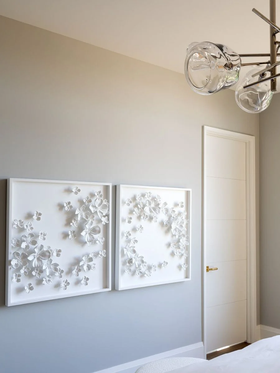
Hanging the Dogwood Bouquet II right next to a mirror or window brings an incredible amount of texture to the room’s perimeter.
This massive, forty-nine-pound wall sculpture features individual four-dimensional dogwood flowers that are hand-cast from original prototypes and arranged on a clean wood backing.
Because the sculpted white flowers literally pop out from the frame, they cast subtle shadows throughout the day as the sunlight shifts across the room.
The Character Note: Adding Whimsical History
To prevent your wall display from looking too formal or staged, you should always tuck in a small, unexpected element that brings personal character.
The Distinguished Pheasant Wall Mount is a delightful addition to nestle directly into a gallery wall or a narrow corner path.
Crafted from cast aluminum with an antique gold finish, this playful plaque depicts a sculpted pheasant wearing a tiny top hat.
It easily mounts via a secure back keyhole, bringing a touch of traditional heritage styling to the arrangement and proving that you don’t take your home design too seriously.
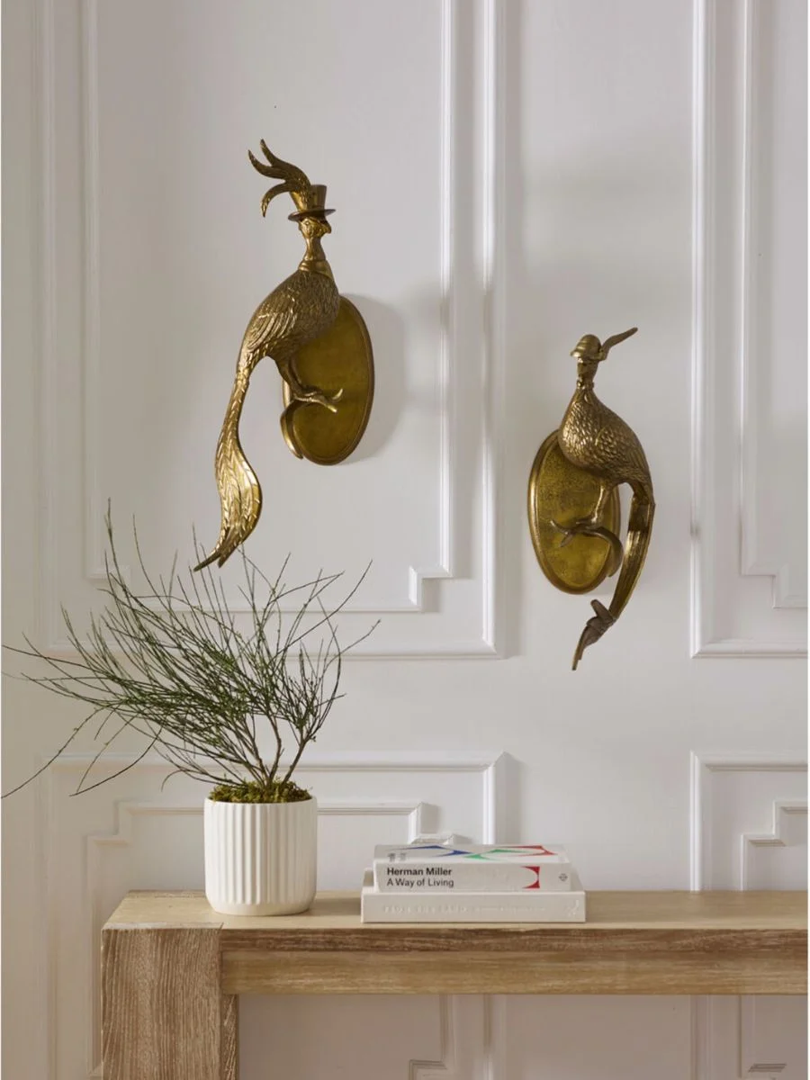
I find that a wall arrangement works best when you pair a large beveled mirror with a textured 3D sculpture, then finish it off with a whimsical metal plaque.
Keeping the gaps between frames under three inches forces the entire collection to look like one cohesive, custom art installation rather than scattered small pictures.
A Quick Note on Mounting Heavy Decor
While three-dimensional pieces and gold leaf completely eliminate the flat look of plain drywall, keep in mind that these heavy steel and resin frames require secure wall anchors. Take your time measuring your layout.
Step 4: Blending Vintage Patina with Regina Andrew Old Money Home Decor
A room styled completely in a single weekend from a single brand can easily look like a sterile furniture showroom.
It completely lacks personality, history, and warmth.
The true secret behind old money home decor is a layer of time—mixing pieces that show a bit of use, organic imperfections, and soft, faded paper tones.
By placing a few one-of-a-kind items directly alongside your modern furniture, you break up the crisp store-bought lines and make your entire home look like it was put together over decades.
A house only starts to feel like a home when you can’t trace every single object back to a current retail catalog page.
The Background Softener: Authentic Paper Textures
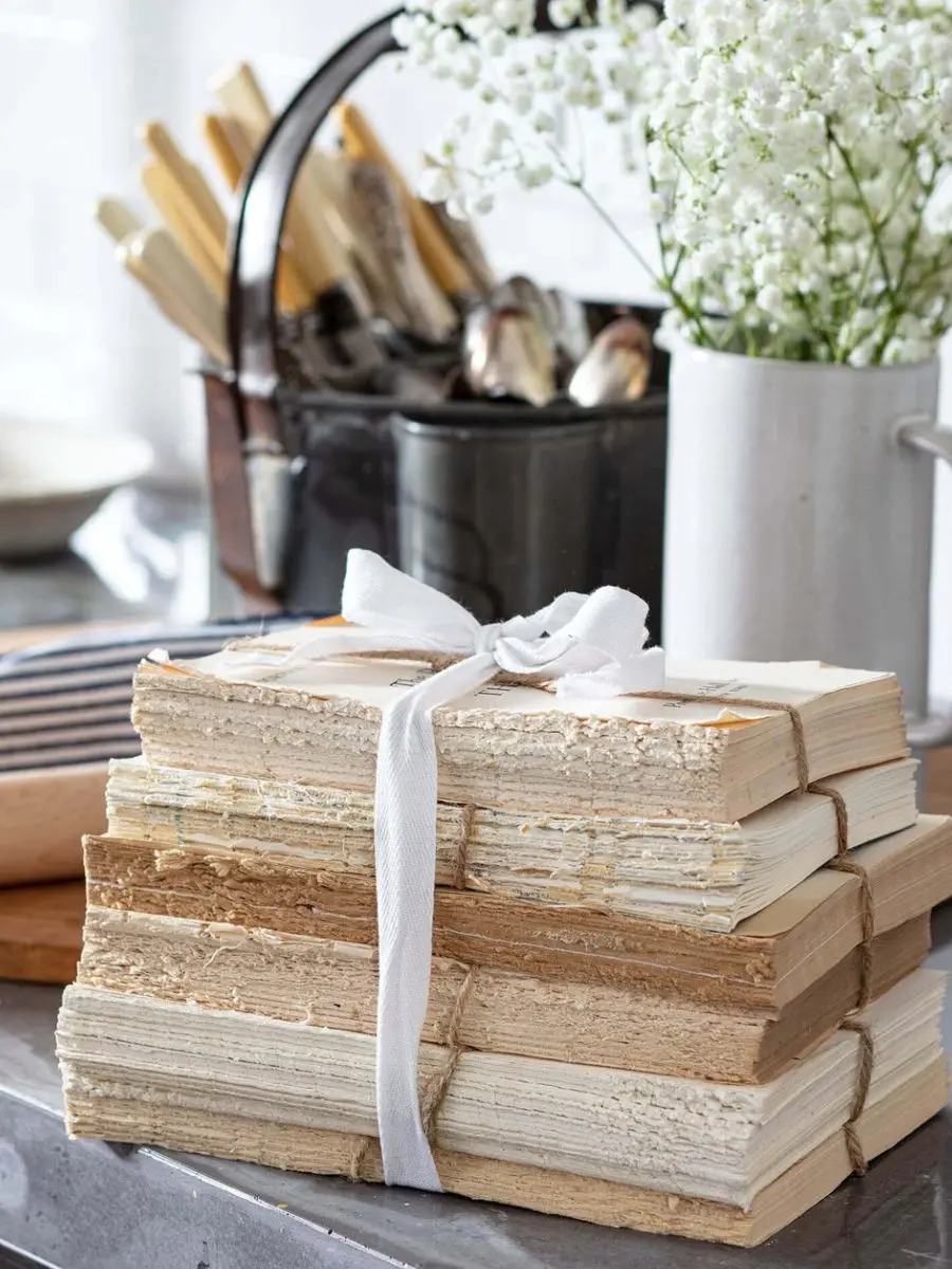
If you want to instantly change the energy of a cold, white bookcase or a modern metal étagère, you need to clear out the plastic trinkets and introduce the Vintage Unbound Books.
Using these raw, coverless textures is an incredible trick, especially when you are figuring out how to style furniture like cane nightstands with gold accents because the warm paper tones instantly soften bright metallic finishes.
This exclusive set features real, one-of-a-kind vintage books that have had their heavy covers removed to expose the rich, aged sepia colors of true antique paper.
Bound with natural twine and featuring beautiful hand-torn edges, these books bring a soft, neutral texture that makes your shelves look deeply personal.
Stacking a few of these books horizontally serves as a high-end pedestal for a small marble plate or box, which instantly adds a sense of history to the surface.
The Conversation Starter: One-of-a-Kind Historical Objects
To complete your vintage layer, you need a standalone object that looks like an artifact discovered while exploring an old estate sale or antique shop.
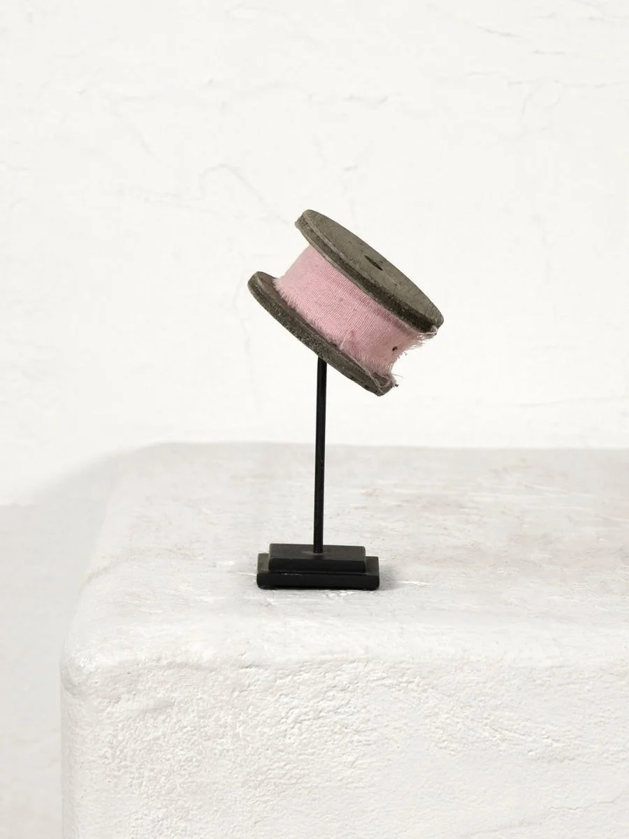
Placing the Thread on Stand right on a workspace desk, a bedside console, or a bookshelf alcove adds an incredible touch of nostalgic charm.
This piece features a genuine, one-of-a-kind vintage wooden thread spool wrapped in original fabric, elegantly mounted on a sleek black steel display stand.
Because these are true vintage pieces, the subtle wear and distressing on the wood aren’t factory defects—they are the exact historical marks that give a room its soul.
Isolating these historical elements on a surface ensures they don’t get lost in a crowd of modern items.
I find that the best balance comes down to keeping eighty percent of your accessories modern and high-end, then mixing in twenty percent imperfect vintage relics to ground the space.
You do not need to turn your home into an antique store to get this look; a tiny, well-placed injection of aged wood or paper is all it takes to make the rest of your modern accessories shine.
A Quick Note on Styling with Vintage Finds
While true vintage accents soften modern furniture and bring a completely unique look to your home, remember that these items will show signs of real history and wear. Because quantities are highly limited, embrace those little imperfections as the exact details that give a room its soul.
The High-End Curation Checklist
To keep a space balanced, I always keep these basic curation rules in mind when sourcing new items:
- Stick to the Palette: Ground a neutral foundation of ivories and beiges with historic accents like British racing green, deep navy, or muted burgundy.
- Float the Layout: Pull your sofa and armchairs at least six inches away from the drywall to create intimate conversation pockets instead of pushing furniture against walls.
- Check the Physical Weight: Avoid hollow, lightweight plastic trinkets. Opt for solid stone, real wood, cast iron, or bone.
- Vary the Scale: Mix wide, flat bases (like trays and plates) with vertical height (like tall vases or substantial bookends).
- Incorporate a Layer of History: Ensure at least one item on your shelves or tables feels old, weathered, or uniquely collected over time.
- Group Your Utilities: Never scatter daily pocket clutter. Corral small items inside structured bowls or decorative boxes.
Frequently Asked Questions
Final Thoughts
True elegance is patient.
Building a beautiful space isn’t about running out to buy a whole showroom full of trendy items all at once.
It’s about ditching the lightweight plastic, clearing the visual noise, and waiting for pieces with real physical weight.
When you surround yourself with objects that have a past, your home finally starts to feel like you.
With elegance,
Bella
