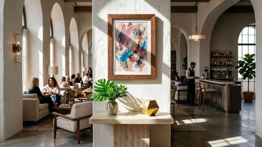
Room curation starts with a plan, but staring at a massive, empty wall in a newly decorated home is incredibly frustrating.
Most of us end up buying individual prints at random, hanging them up, and then realizing the room feels completely unorganized.
Disclosure: This post contains affiliate links. I may earn a small commission at no extra cost to you.
A loud, chaotic abstract print can easily ruin the peace of a quiet bedroom, while a tiny, faint watercolor completely gets lost on a large dining room wall.
If you want your home to look styled and thoughtful, you have to choose artwork based on how you actually use the room and the mood you want to create.
This guide breaks down the basics of hands-on styling using timeless wood frame layouts from Poster Master Studio, helping you match your favorite prints to your furniture layout without the guesswork.
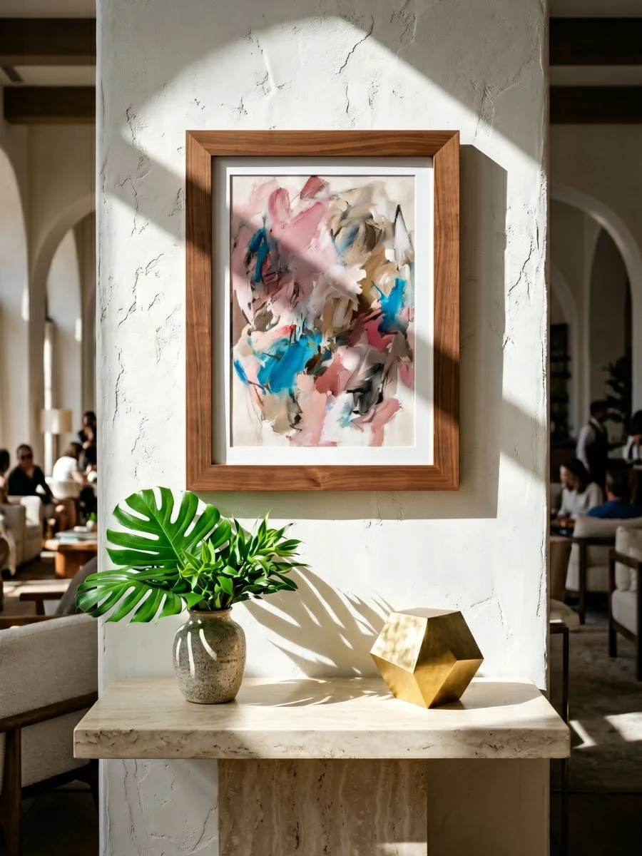
The Architecture of Room Curation
Before diving into step-by-step room setups, you can use this quick layout reference guide to instantly match your empty space with its ideal geometric configuration:
| Room Type | The Spatial Headache | The Proportional Framing Solution |
| Living Room | Overwhelming open space above a sofa couch. | One monolithic centerpiece paired with soft organic accents. |
| Music Lounge | Small, narrow accent corners feeling cold. | Leaning floor graphics balanced by bold typography frames. |
| Main Bedroom | Empty space above the headboard causing stress. | Soft script quote centered tightly between texturing accents. |
| Dining Area | Cheesy, cheap-looking commercial kitchen signs. | Black-and-white lifestyle photography and fine art studies. |
| Reading Nook | Sterile, corporate layouts that block focus. | Staggered, deeply layered classical oil replicas. |
Below, this comprehensive layout handbook explores the five most common spatial headaches home decorators face, providing a direct, practical blank wall solution for each area.
How to Style the Wall Above Your Sofa
The empty space directly above your main sofa couch is the largest and most visible canvas in your entire home.
Leaving this massive area completely bare makes your entire seating layout look cold, uninviting, and unfinished.
However, over-packing this central surface with dozens of small, mismatched frames creates a chaotic amount of visual noise in the one area where you are supposed to relax and host friends.
The practical blank wall solution for this high-traffic zone requires anchoring the architecture of the room by combining a single, oversized monolithic centerpiece with soft, nature-inspired negative space prints to bring structural balance to your main seating arrangement.
Hanging the Centerpiece and Side Prints
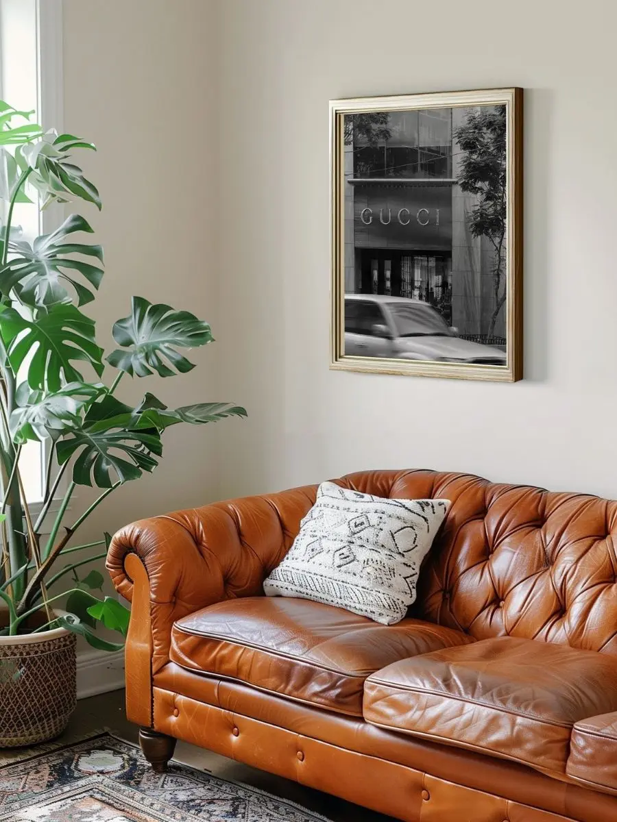
To execute this layout flawlessly while sticking to proven affordable luxury interior design rules, you must start by hanging your large-format black-and-white print directly in the physical center of the wall space above your sofa.
Aligning your main artwork this way anchors the entire seating area and ensures your wall doesn’t feel cold or empty.
Using clean, architectural black-and-white lines grounds the open wall immediately, giving the room an expensive, boutique showroom foundation.
Next, you can balance the heavy visual weight of a monochrome storefront by layering in rich, organic foliage textures right beside it.
This natural texture matches perfectly if you have large, real-world indoor houseplants sitting in your room corner.
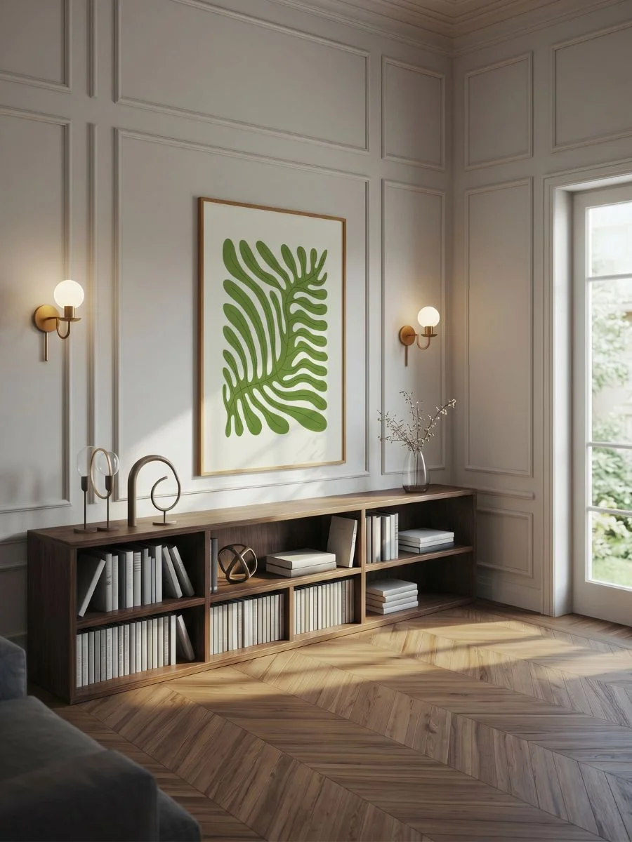
Complete the triptych setup by incorporating cool indigo depths and crisp white negative space blocks to create an organic, slow-paced visual sequence that eliminates empty space without crowding your vision.
Pro Tip: When you create a side-by-side triptych configuration above a wide sofa, skip bulky or ornate borders. Opt for slim, ultra-thin 0.5-inch natural light oak frames so your nature-inspired posters can breathe and look like a seamless extension of your wall.
Pros and Cons of Large-Scale Living Room Art
| Benefits of Oversized Framing Sets | Trade-offs to Consider |
| Instantly unifies your furniture and paint. | Requires strict, measured leveling during setup. |
| Eliminates the need for multiple accent decorations. | Moving large-format frames requires extra care. |
| Gives standard apartments a premium hotel lobby feel. | Requires a commitment to a singular focal point. |
Setting Up a Clean Grid in Your Music Corner
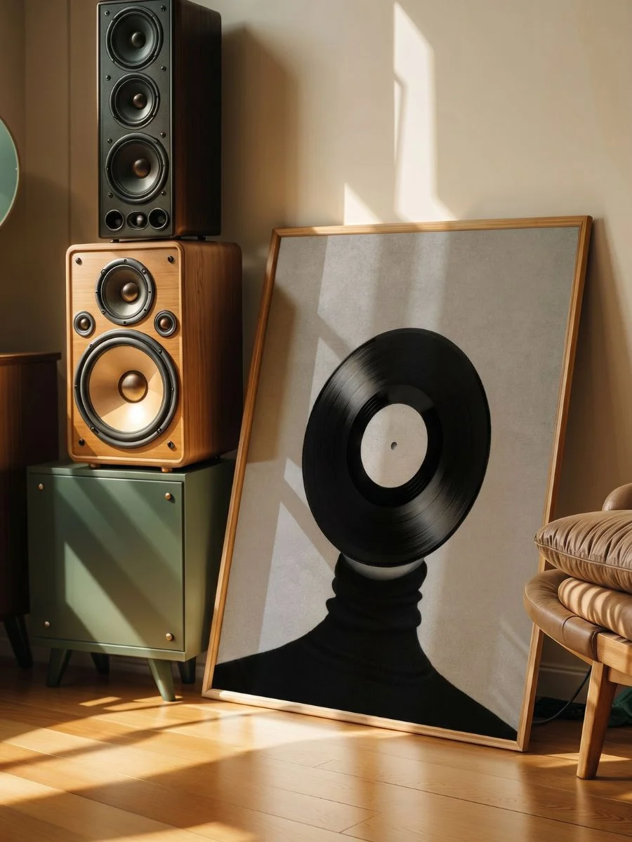
When you style a dedicated vinyl record player station, a small audio nook, or an accent wall next to a listening chair, using traditional landscape art completely clashes with the creative spirit of the space.
You want this specific zone to feel rhythmic, soulful, and highly creative, without turning it into a messy, uncoordinated pile of casual teenage music posters.
I find that the best blank wall solution here is to lean into a disciplined, mid-century modern aesthetic by pairing deep charcoal collage textures with bold retro typography.
(I actually discovered this specific framing method while browsing independent design archives last spring, and it completely changed how I perceive narrow accent corners).
The shift is immediate.
Aligning Your Frames in a Perfect Grid
To bring an authentic, analog energy to this corner, start by placing your primary textured music graphic directly near your turntable setup.
You do not even have to mount it to the plaster; letting a large framed print rest elegantly on the floor next to vintage wooden audio speakers creates an incredibly relaxed, editorial atmosphere.
To contrast the dark visual weight of the charcoal vinyl elements, mount your vibrant retro typography graphic on the wall directly above it.
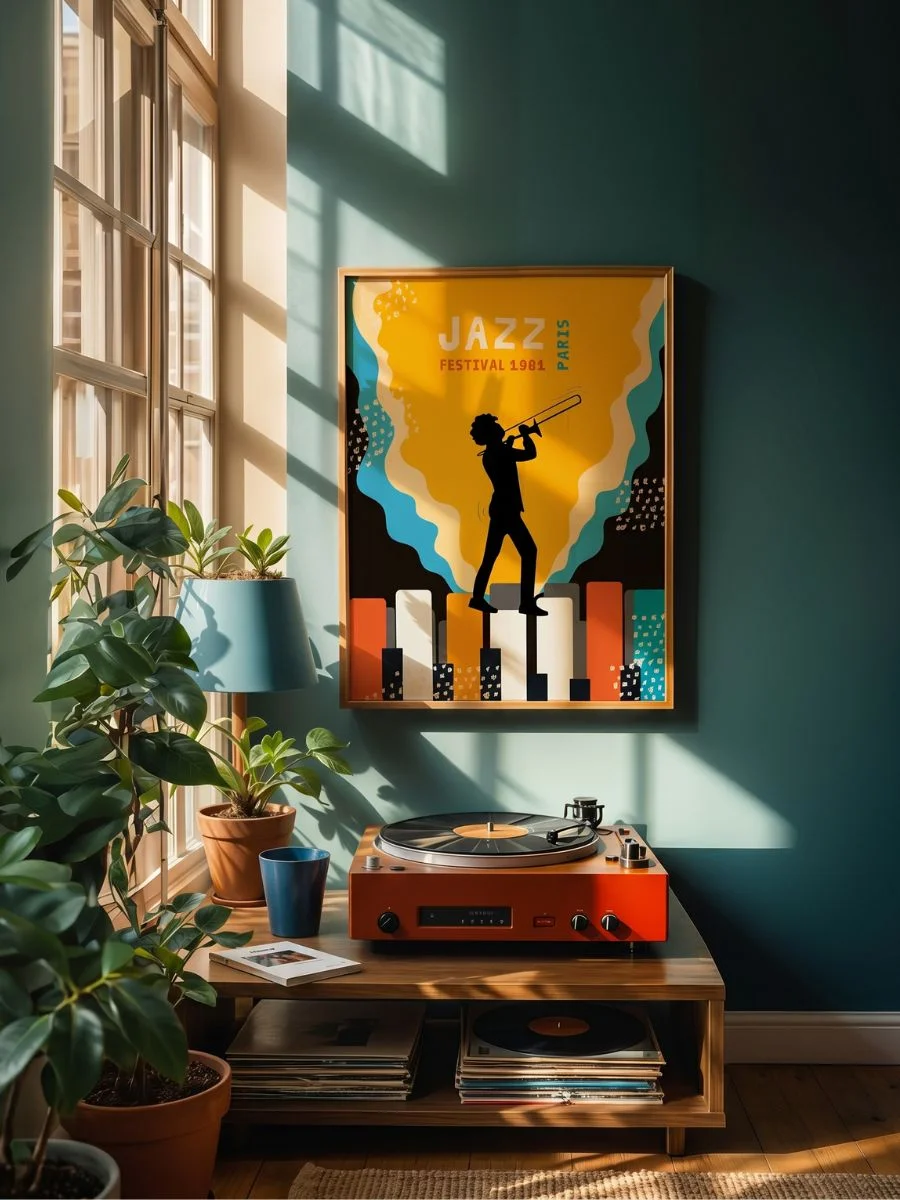
The intense color pop breaks up the moody neutral tones of the listening corner, infusing a highly sophisticated gallery energy into the room layout.
Pro Tip: When grouping highly energetic, mismatched graphic poster styles, your spacing must remain completely uniform. Use a tight, disciplined 2-inch gap between frames to force the brain to see a singular installation rather than a chaotic cluster.
Pros and Cons of Graphic Typographic Art
| Benefits of Bold Typographic Curation | Trade-offs to Consider |
| Injects instant movement and creative energy. | Vibrant red backdrops can compete with soft beige walls. |
| Functions as a brilliant, modern conversation starter. | Requires pairing with clean, simple furniture lines. |
Choosing Calm Prints for Your Bedroom
The blank space directly above your bed frame or headboard is notorious for feeling cold, empty, and unfinished.
However, if you choose prints that are too aggressive, dark, or busy, it causes sensory overload and ruins the peaceful atmosphere you need to unwind at night.
You want glamour, sophisticated texture, and chic confidence without sacrificing your sleep quality.
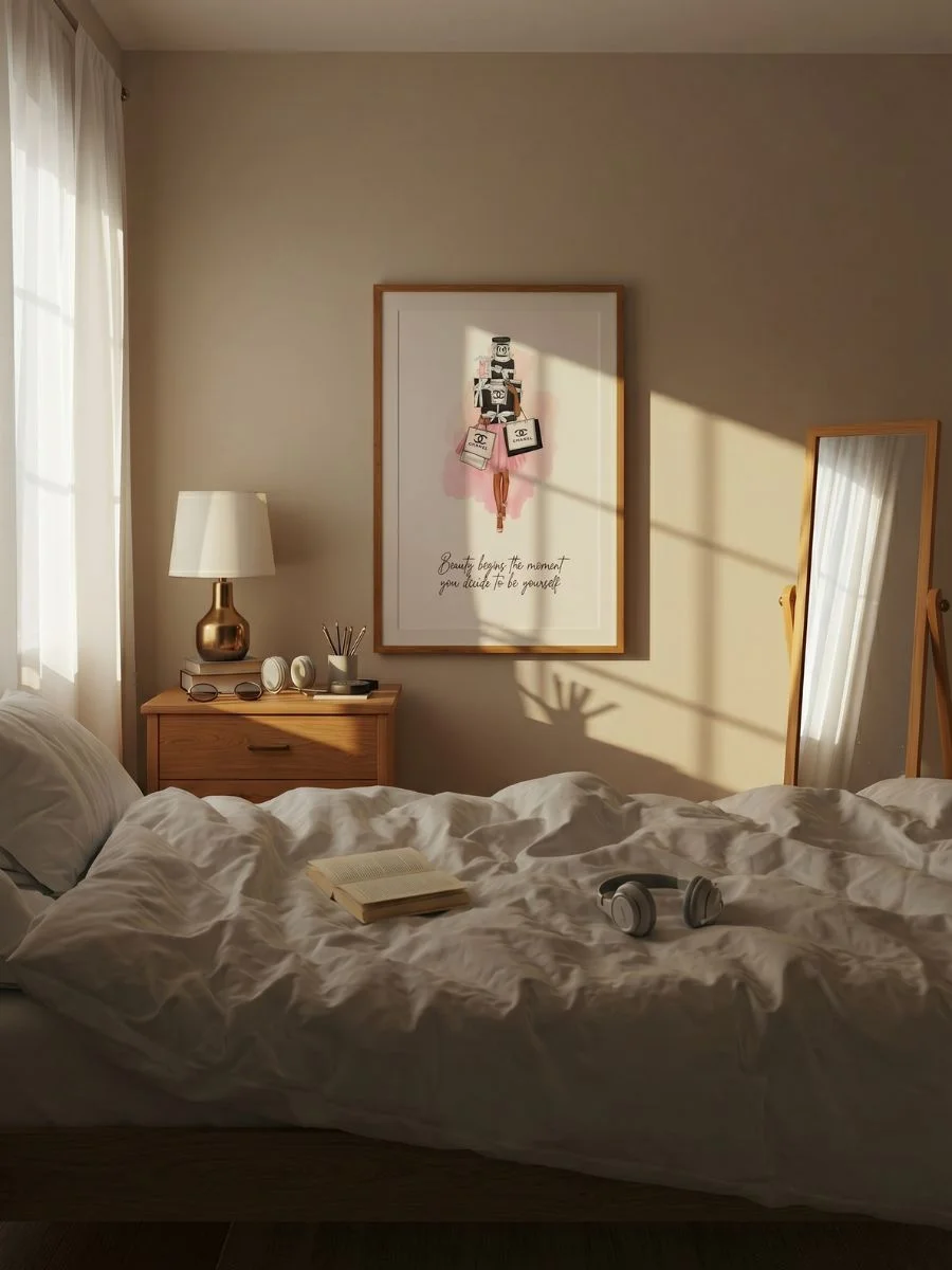
The practical blank wall solution for this private sanctuary requires balancing bold, playful pop art accents with soft typography scripts centered perfectly over your bedding layout to set a clear, calming morning tone.
Matching the Colors to Your Bedding
To bring an upscale, boutique hotel energy to your bedroom, start by hanging the gentle script and calming neutral tones of the text print right above your headboard center line.
This sets a highly inspiring, sophisticated morning tone that you see the moment you open your eyes.
Next, flank the central typography block with your more energetic accent pieces.
You can layer the rich, high-contrast pink tones of the glamorous lip print on one side, and the reflective, retro textures of the mirror spheres on the other.
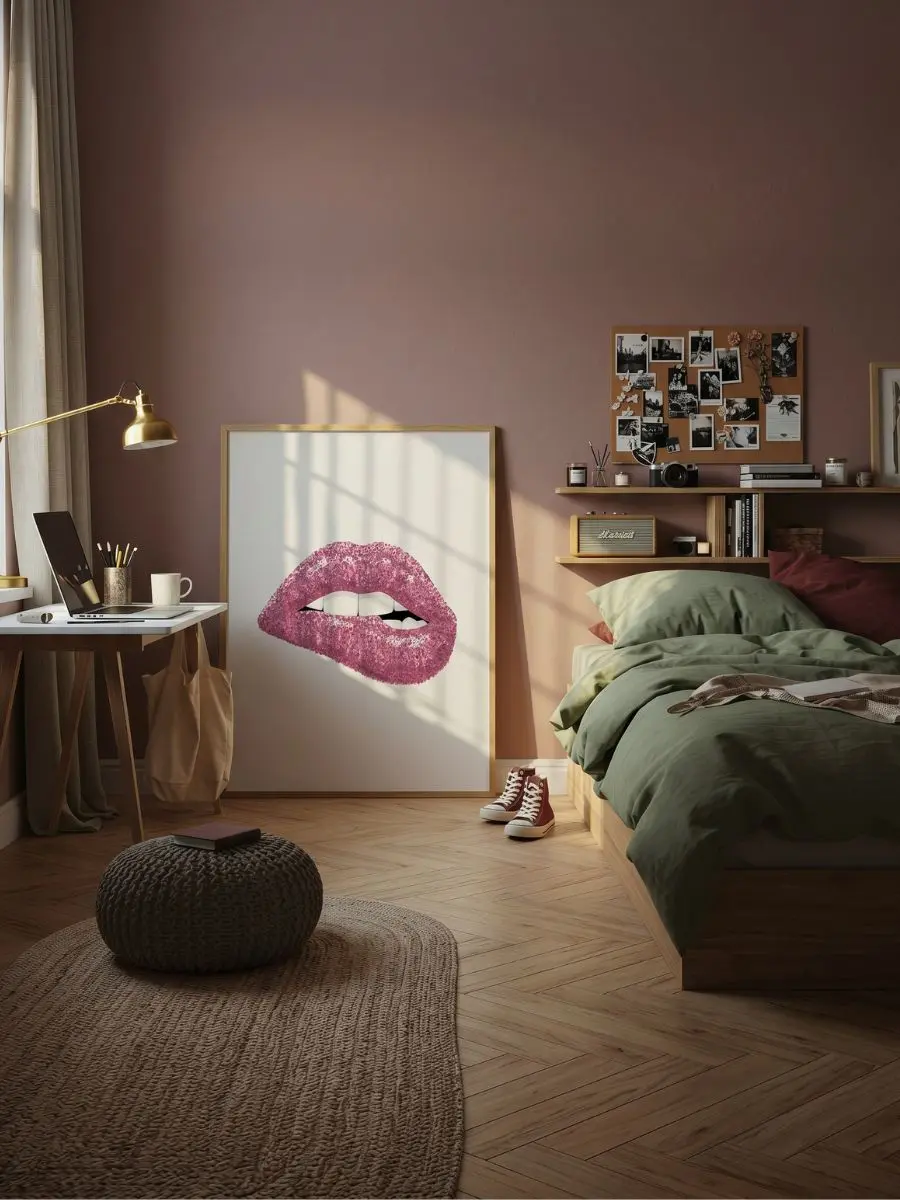
(I usually suggest choosing a matching brushed gold or rose gold frame finish for these pieces—a tiny framing detail that completely unifies the glamorous theme and makes your bedding colors pop).
To ground the entire arrangement and prevent the shimmering elements from looking chaotic, complete the cluster with a minimal line drawing to add crucial visual breathing room.
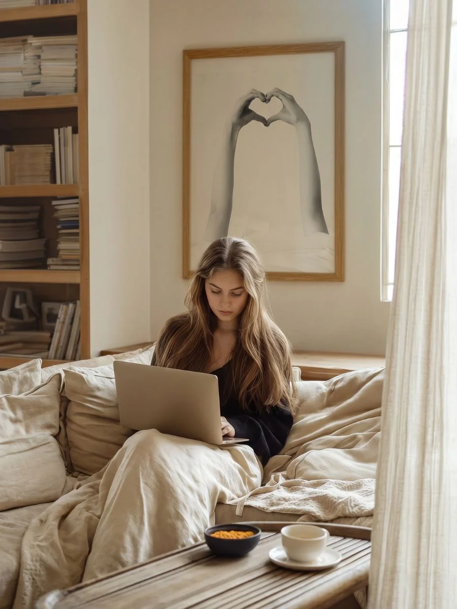
Pro Tip: When hanging a three-print poster arrangement directly above a bed, always ensure the total width of the combined frames spans roughly 60% to 75% of your mattress width. Mount the frames exactly six to eight inches above the top mattress or headboard cushion so the prints feel visually anchored to the furniture.
Pros and Cons of Glamour Bedroom Curation
| Benefits of Feminine Glamour Layouts | Trade-offs to Consider |
| Injects incredible morning energy and personal confidence. | Intense pinks require neutral, soft bedding colors. |
| Creates an instant luxury boutique hotel ambiance. | Shimmering disco ball textures need soft ambient lighting. |
| Perfectly balances hard walls with soft textiles. | Requires disciplined minimalist framing to stay calm. |
Related reading: For complete design inspiration on how to pair your newly curated bedroom wall art with organic furniture textures, explore our step-by-step guide on how to style a cane nightstand with gold hardware to flawlessly coordinate your entire bedside layout.
Where to Hang Art in Your Eating Space
Finding sophisticated art for a high-end kitchen remodel or an elegant dining area is an incredibly difficult task.
Most online wall decor features cheesy cafe text or generic, cartoonish coffee illustrations that completely cheapen your home’s aesthetic value.
When you invite guests over for a dinner party, you want your dining space to feel warm, inviting, and layered with conversation-starting texture, rather than looking like a generic commercial coffee shop.
The most effective blank wall solution for your culinary areas is to replace predictable illustrations with timeless, monochromatic lifestyle photography and classical oil still life reproductions.
It changes everything.
Centering the Layout with Your Table
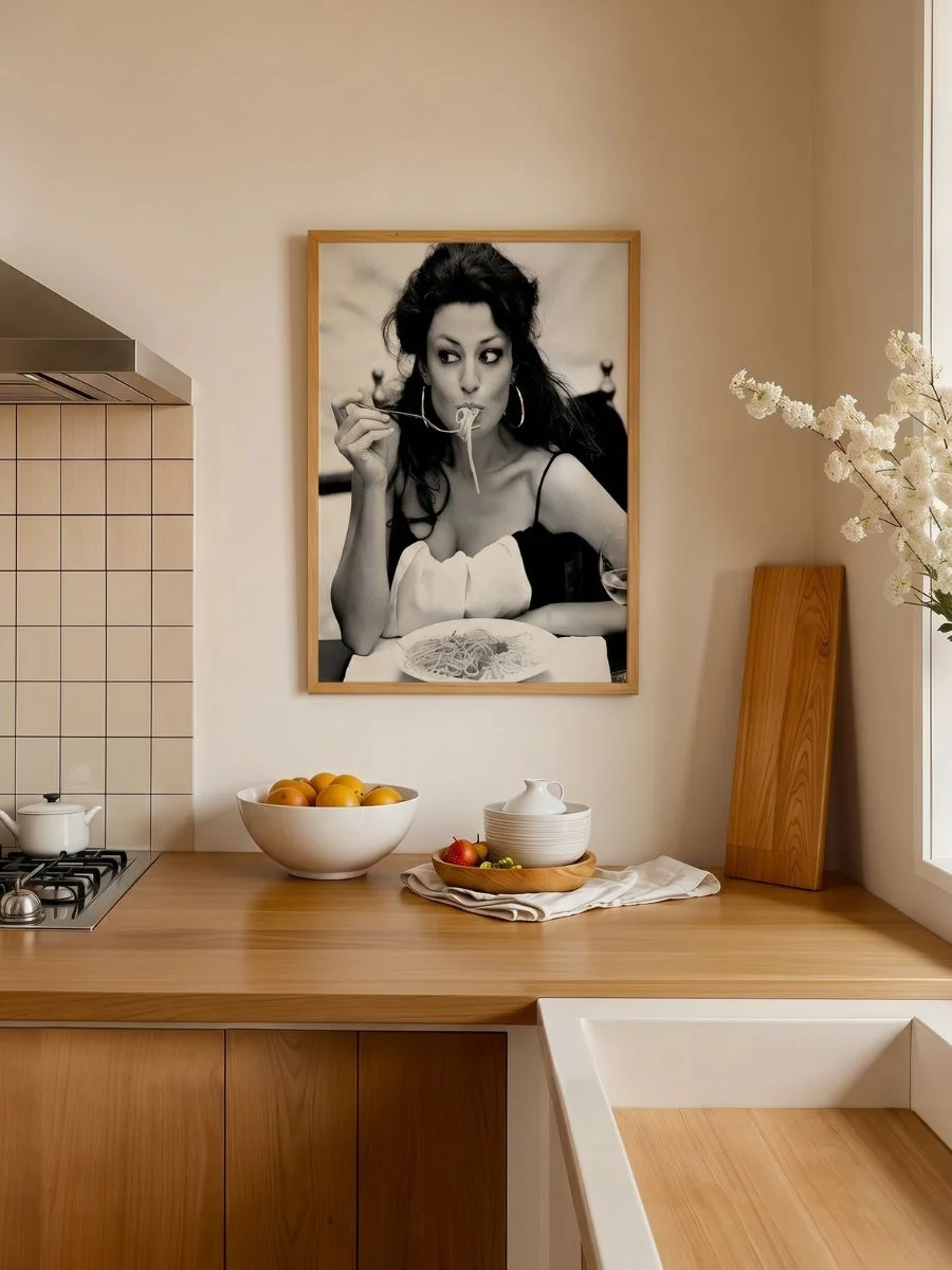
To transform your dining walls, use the striking cinematic energy of your primary black-and-white print as the central focal point directly above your dining table layout.
Monochromatic lifestyle photography acts as an absolute design neutral, bringing an effortless vintage Hollywood texture and high-fashion glamour to the walls.
To balance the stark contrast of the photography, inject rich, saturated color tones by hanging your classical fruit still lifes directly adjacent.
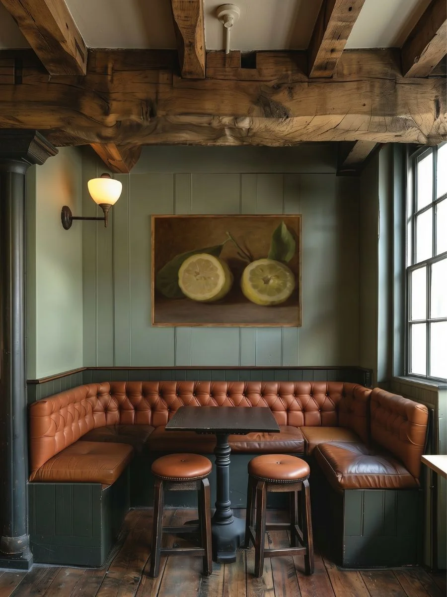
The deep, vivid yellows of the lemons and the organic, earthy red tones of the apples create an appetizing, luxurious visual environment.
(I brought this exact pairing into a friend’s dining space recently, and it instantly shifted the room from a cold white box into an intimate, European boutique bistro aesthetic).
Pro Tip: Dining spaces feature heavy overhead lighting and large windows that create blinding sun glare on glass-covered frames. Swap standard poster paper and glass for a textured, matte canvas finish that naturally absorbs harsh reflections and easily resists kitchen humidity warping.
Pros and Cons of Culinary Fine Art
| Benefits of Dining Fine Art | Trade-offs to Consider |
| Far more sophisticated than generic kitchen quotes. | Real photography requires custom, premium framing. |
| Rich oil fruit textures naturally stimulate appetite. | Bright yellows can overwhelm very pale walls. |
| Black-and-white photography matches any paint color. | Requires regular surface wiping to prevent grease buildup. |
Tips for Decorating a Small Reading Corner
Those narrow accent walls, quiet hallway alcoves, and empty corners next to a reading chair are notorious for feeling cold, neglected, and detached from the rest of your home.
You want to transform these small floor plans into deeply layered, warm, and intellectually rich sanctuaries, but you cannot add heavy bookshelves or bulky decorative furniture without physically overcrowding the tight walking layout.
The practical blank wall solution for a forgotten nook is to use moody, historic oil reproductions stacked tightly alongside crisp literary text frames to add instant warmth and old-money architectural depth to your bare wall.
It changes the room instantly.
Layering Art Near a Bookshelf or Chair
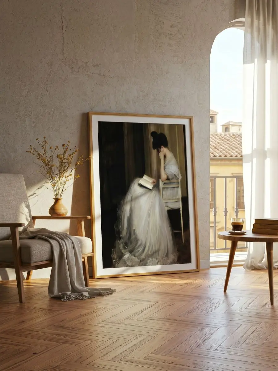
To build an inspiring, cozy sanctuary, start by hanging the deep, dark textures of your classical oil painting reproduction directly at eye level right next to your seating area.
This establishes a rich, historic foundation that grounds the visual height of the narrow wall, making the corner feel instantly purposeful.
Next, place your crisp typography print right beside or stacked directly beneath it to balance the moody, intense brushstrokes.
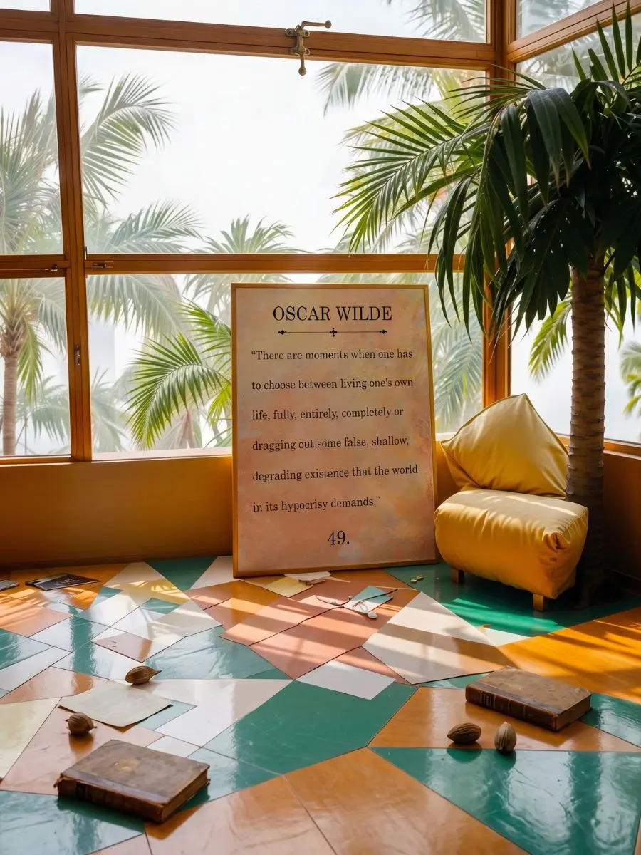
Typography prints introduce clean, disciplined lines that provide your eyes with the necessary visual breathing room when relaxing in a quiet space.
Finally, add a touch of unexpected charm by integrating a whimsical, high-society pet portrait into the gallery corner layout.
(I am usually quite cautious about using animal art in formal areas, but these specific aristocratic uniforms add a beautiful, old-money British estate charm that breaks up any potential decorative stiffness).
An unexpected twist.
Pro Tip: In tight, windowless reading alcoves or small home accent corners, always choose frames equipped with wide, crisp white or soft cream matboard margins. This built-in card border isolates the dark color values of historic oil paintings, preventing them from making a small corner feel dark or claustrophobic.
Pros and Cons of Historical Nook Curation
| Benefits of Cozy Gallery Layouts | Trade-offs to Consider |
|---|---|
| Adds instant history and old-world character to small walls. | Dark color tones require good ambient lighting setups. |
| Makes simple reading corners feel premium and expensive. | Typography prints can feel cold if overused without art. |
| Creates a quiet, deeply contemplative visual retreat. | Distinct animal portraits require a playful sense of humor. |
Alternative Art Movements to Explore
If you want to expand your home’s personality beyond the main rooms we discussed, it helps to explore alternative historic art movements.
Adding different art styles allows you to solve specific blank wall dilemmas in secondary spaces like hallways, bathrooms, or entryways without repeating the same layout formulas.
Before making a spontaneous art purchase, you can use this quick-reference guide to instantly match your secondary household corners with their ideal historic art textures:
| Visual Texture Category | Target Design Problem | Best Structural Room Placement |
| Traditional Botanical | Softens cold, sun-drenched spaces with dense leaf patterns. | Guest Bedrooms & Sunrooms |
| Japanese Watercolor | Adds peaceful, organic earth tones to damp, humid walls. | Bathrooms & Meditation Corners |
| Classic Ukiyo-e | Creates deep perspective lines in tight, windowless paths. | Minimalist Hallways & Corridors |
| Post-Impressionist Graphic | Injects high-contrast artistic creativity without clutter. | Creative Studios & Home Offices |
| Baroque Masterpiece | Establishes a majestic, formal focus on a clean accent wall. | Formal Living Rooms & Dining Areas |
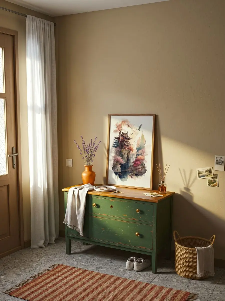
Simple Architectural Sketches for Narrow Hallways
Hallways and small entryways can easily feel tight or dark.
Hanging a clean sketch with plenty of white space in the matting helps open up narrow walkways and makes a small corridor feel much brighter.
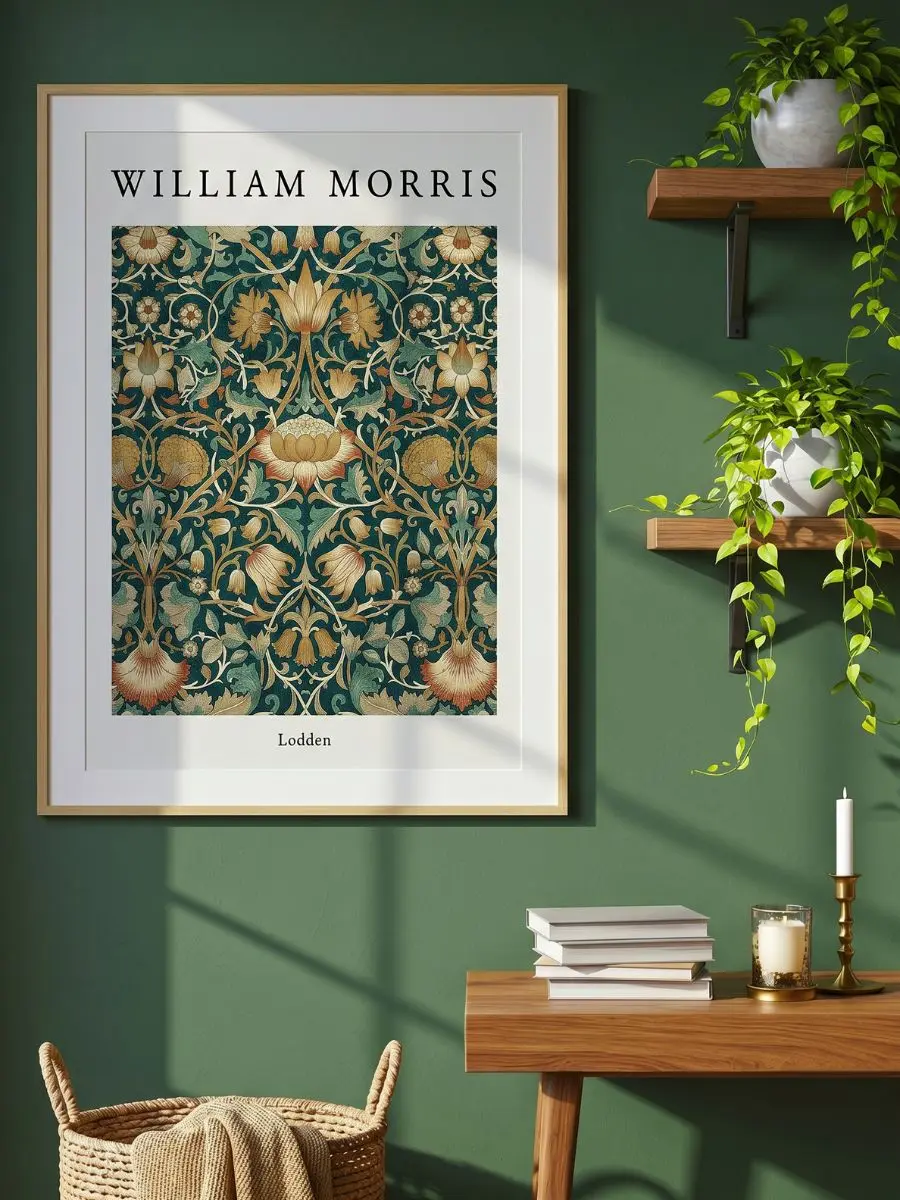
Cozy Heritage Patterns for Guest Bedrooms
For spare bedrooms or cozy sitting areas, deep historical patterns add an instant sense of warmth.
These styles work beautifully against simple wooden furniture and bring character to rooms that otherwise feel a bit empty.
WHAT TO READ NEXT: Now that you know how to eliminate visual clutter on your walls, bring that same sophisticated, stress-free energy into your kitchen workflow. Read our step-by-step guide on how to design a high-efficiency Luxury Pantry on a Budget to eliminate daily disorganization and elevate your entire home layout.
Blank Wall Solutions: Frequently Asked Questions
How do you choose the right frame color for a mixed gallery wall?
The easiest way to maintain an elegant, reader-friendly editorial look is to keep your frame material completely uniform across the entire collection.
I always suggest using a single finish, such as smooth, natural light oak wood or slim matte black frames, to house every print.
This absolute consistency binds completely different art movements together, allowing your personal taste to shine without looking messy.
Should you use canvas prints or standard paper posters in a humid room?
For high-humidity zones like small guest bathrooms or near kitchen stovetops, you should always opt for a textured matte canvas finish.
Standard poster paper rapidly absorbs airborne steam, which causes the prints to warp, ripple, and buckle against frame glass within months.
Canvas surfaces breathe naturally, resisting moisture damage while completely absorbing harsh overhead light reflections.
What is the correct spacing distance between different frame sizes?
To create a high-end, professionally styled finish, you must keep your frame spacing tight, disciplined, and strictly uniform.
Aim for an exact two-to-three-inch gap between every single piece in your gallery layout, regardless of how large or small the frames are.
This tight physical proximity forces the human brain to process the entire wall display as a singular, beautiful art installation rather than separate fragments.
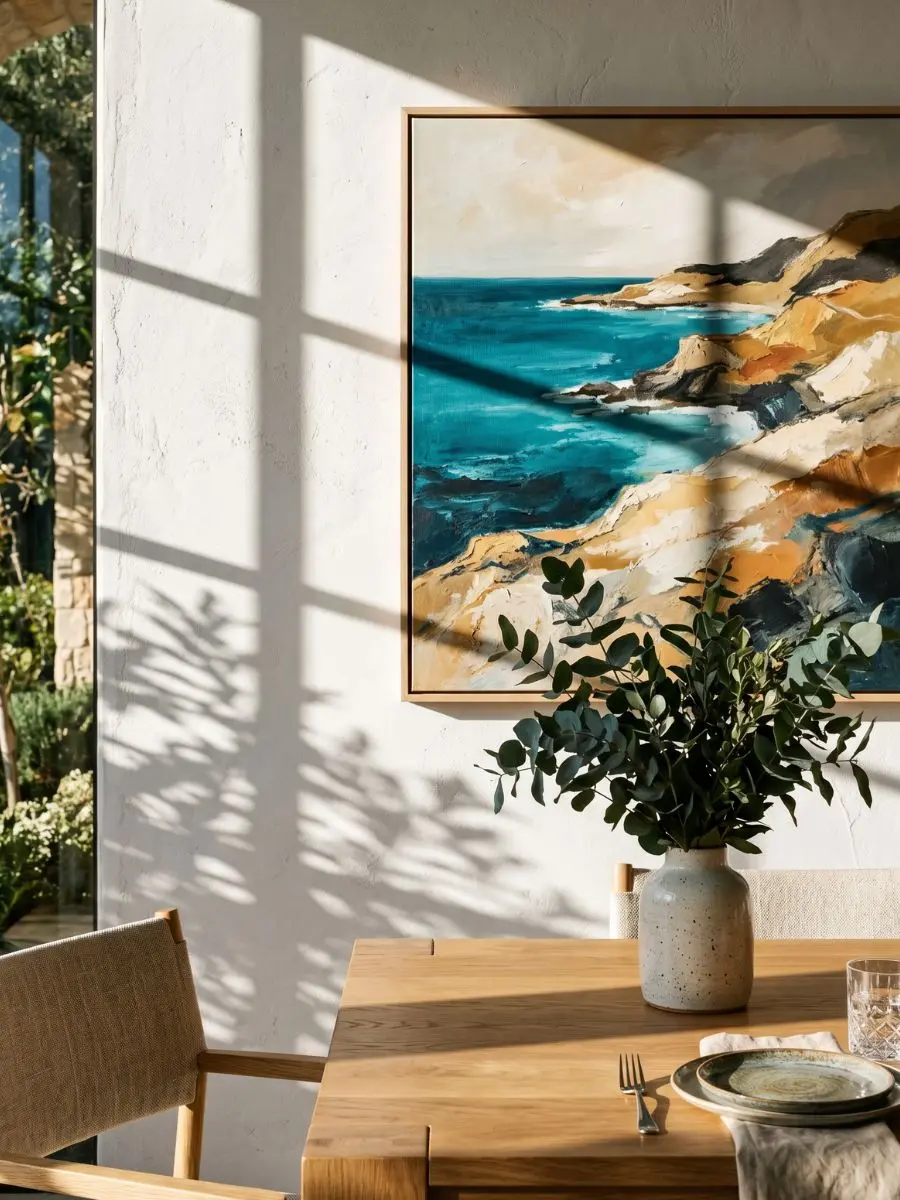
The Final Edit
Successful room curation does not require a big budget or an interior designer.
It simply comes down to a few basic steps: keeping your spacing consistent, hanging your frames close to your furniture lines, and making sure the style of the art matches the purpose of the room.
When you treat your bare walls as a single plan rather than a random collection of frames, you instantly make your home feel more organized and relaxing.
Before you hang anything, use a bit of painter’s tape on the wall to test out your spacing and layout.
Choose three to five pieces that look good together, take your time measuring, and you will easily turn your empty walls into a thoughtful, personal space.
With elegance,
Bella